Code
# Load metadata and summary statistics
metadata <- readRDS(here("blog", "Gbif Kenya", "data", "processed", "metadata.rds"))
summary_stats <- readRDS(here("blog", "Gbif Kenya", "data", "processed", "summary_stats.rds"))IMPORTANT NOTICE: This document represents an independent analysis conducted to satisfy scientific curiosity and advance biodiversity data science methods. It has not undergone formal peer review and should not be cited as a peer-reviewed publication. While the methods employed follow established scientific standards and best practices in biodiversity informatics, the findings and interpretations presented here are preliminary and subject to revision. This work is shared openly to:
Users of this analysis should exercise appropriate scientific judgment and consider conducting additional validation for critical applications. Feedback, suggestions, and collaborative refinement of these methods are welcome.
Main Tables
Interactive Figures 🎯
Appendix Figures 📊
Background: Large observational datasets—from biodiversity records to public health surveillance—face common challenges of data quality issues and systematic sampling biases that can affect research conclusions and evidence-based decisions. Despite widespread recognition of these issues, most studies lack comprehensive documentation of quality problems and fail to systematically assess multi-dimensional biases. We present a general framework for data quality assessment and cleaning, demonstrated through application to Global Biodiversity Information Facility (GBIF) occurrence data from Kenya.
Framework Objectives: We developed and demonstrate a comprehensive framework for assessing and documenting data quality issues and systematic biases in large observational datasets. The framework emphasizes: (1) systematic flagging of quality issues without automatic removal, (2) transparent documentation of filtering decisions for each analysis, (3) multi-dimensional bias assessment (spatial, temporal, categorical), (4) sensitivity analysis comparing filtering strategies, and (5) complete reproducibility. While demonstrated using biodiversity data, the framework principles and methods are transferable to other observational data domains.
Methods: We downloaded 4,987,869 occurrence records from GBIF for Kenya and implemented a systematic quality flagging framework that identified and documented seven major quality issues: missing coordinates, high coordinate uncertainty (>10 km), inappropriate basis of record, missing species identification, invalid dates, duplicates, and coordinate quality flags. Critically, our approach flags quality issues rather than automatically removing records, allowing each downstream analysis to apply filters appropriate to its specific requirements. We assessed spatial bias using grid-based analyses, environmental space coverage, and spatial autocorrelation. Temporal bias was evaluated through trend analyses and completeness metrics. Taxonomic bias was quantified using diversity indices and species accumulation curves. We used generalized linear models (GLMs) and generalized additive models (GAMs) to identify environmental and geographic predictors of sampling effort.
Results: Data quality assessment identified issues in 2,728,482 records (54.7%), with coordinate-related problems being most common: 641,335 records (12.9%) flagged by CoordinateCleaner tests. Different analyses applied different quality filters based on their requirements: spatial bias analysis required valid coordinates and species identification but retained records near cities (the bias being measured); temporal analysis required valid dates but not coordinates; taxonomic analysis required only species identification. Under a moderate filtering strategy (coordinates, species, dates, no coordinate errors), 3,841,122 records (77%) were retained. Our bias analyses revealed significant spatial, temporal, and taxonomic biases. Sampling effort was concentrated near major cities and roads, with strong positive spatial autocorrelation (Moran’s I = 0, p < 0.001). Temporal analysis showed increasing trends in data collection, with 2.14 coefficient of variation in annual records. Taxonomic coverage was highly uneven, with a Gini coefficient of 0.966 for records across classes.
Conclusions: This framework addresses critical gaps in data quality documentation and bias assessment for large observational datasets. The Kenya biodiversity case study demonstrates: (1) how systematic flagging enables flexible, analysis-appropriate filtering rather than one-size-fits-all cleaning; (2) how multi-dimensional bias assessment reveals patterns that single-dimension analyses would miss; (3) how sensitivity analysis quantifies the impact of different quality control decisions; and (4) how complete documentation enables reproducibility and adaptation. While demonstrated with biodiversity occurrence data, the framework provides a methodological template applicable across observational data domains—from epidemiological surveillance to environmental monitoring to citizen science. The complete R implementation, with extensive documentation and educational features, serves as both a practical toolkit and a teaching resource for modern data science practices.
Keywords: data quality, data cleaning, observational data, sampling bias, reproducible research, GBIF, biodiversity data, Kenya, spatial bias, temporal bias, bias assessment
Large observational datasets—whether biodiversity records, public health surveillance, environmental monitoring, or citizen science observations—face common challenges that affect their utility for research and decision-making. This document presents a comprehensive framework for data quality assessment and cleaning demonstrated through application to biodiversity occurrence data. While our case study uses Global Biodiversity Information Facility (GBIF) data from Kenya (over 2 billion records globally; GBIF (2023)), the methods, workflows, and principles apply broadly to any large observational dataset with spatial, temporal, and categorical dimensions.
The fundamental challenge is that the utility of observational data depends on both data quality (accuracy and completeness of individual records) and representativeness (whether sampling patterns introduce systematic biases). These issues are universal across observational data domains, not unique to biodiversity informatics (Meyer et al. 2016).
Large observational datasets typically face two distinct but interconnected challenges:
Data Quality Issues include technical errors and inconsistencies such as missing coordinates, erroneous locations, incomplete categorical information, temporal inconsistencies, and duplicate records (Zizka et al. 2019). These issues are common across observational datasets and arise from: - Historical data digitization with incomplete metadata - Georeferencing errors when converting text descriptions to coordinates (biodiversity, disease surveillance) - Category revisions that create outdated classifications (taxonomy, disease codes, demographic categories) - Data entry mistakes during transcription or digitization - Multiple data sources sharing the same observations, creating duplicates - Sensor or measurement errors in automated recording systems
Systematic Biases stem from non-random observation patterns that create uneven coverage across space, time, and categories (Beck et al. 2014, Hortal et al. 2015). Unlike quality issues (which are errors), biases reflect real patterns in where, when, and what gets observed or sampled: - Spatial bias: Observations concentrated in accessible areas (near roads, cities, facilities) - Temporal bias: Changing observation intensity over time (often increasing with technology adoption) - Categorical bias: Focus on certain categories (charismatic species, common diseases, specific demographics) - Methodological bias: Different detection methods with varying efficiency - Reporting bias: Differential likelihood of reporting certain observations
Both quality issues and systematic biases can substantially affect downstream analyses if not properly addressed. Quality issues introduce noise and errors, while biases create misleading patterns that can be mistaken for real signals. For example, in biodiversity data, high species richness near cities might reflect sampling effort rather than true ecological patterns; in health surveillance, disease prevalence near hospitals might reflect testing availability rather than true epidemiology.
This framework is demonstrated using GBIF biodiversity occurrence data from Kenya, which serves as an ideal case study for several reasons:
Representative Challenges: Kenya’s biodiversity data exhibit common issues found in many large observational datasets: - Historical records with incomplete metadata alongside modern high-precision observations - Sampling concentrated in accessible areas (cities, roads, research stations) - Uneven temporal coverage reflecting changing research priorities and technologies - Taxonomic focus on certain groups (birds, large mammals) with limited coverage of others
Practical Importance: Beyond demonstrating the framework, this assessment has real-world value for Kenya: 1. The country hosts numerous endemic and threatened species requiring evidence-based conservation 2. Climate change impacts on East African biodiversity need robust baseline data assessment 3. Conservation planning and protected area management depend on understanding data limitations 4. National biodiversity monitoring and reporting obligations require reliable data sources
Transferability: The methods demonstrated here—quality flag documentation, multi-dimensional bias assessment, sensitivity analysis, and flexible filtering strategies—can be directly adapted to other contexts such as disease surveillance systems, environmental sensor networks, citizen science platforms, or social survey data.
A common problem across research domains is inadequate documentation of data cleaning procedures. Studies typically report only the final cleaned dataset size (e.g., “After quality control, 500,000 records remained”), without specifying: - What specific quality issues were identified and in how many records - What percentage of records had location errors, missing information, or duplicates - Which quality issues were filtered out vs. flagged for attention - Whether different analyses used different filtering strategies - Whether systematic biases were assessed and how they might affect conclusions
Furthermore, many studies apply a single, strict filtering strategy to all analyses, potentially: - Removing the signal: Filtering out the very patterns that should be studied (e.g., removing urban observations when studying accessibility bias) - Unnecessary data loss: Discarding records that would be valid for certain analyses (e.g., records without coordinates can still contribute to temporal or categorical assessments) - Over-filtering: Applying unnecessarily strict standards that reduce statistical power without improving analysis quality
This lack of flexibility and transparency makes it difficult to: - Assess whether quality standards were appropriate for each specific analysis - Compare data quality across datasets, regions, or categories - Evaluate fitness-for-use for different research questions - Replicate cleaning procedures in other studies - Identify systemic issues that data providers could address - Conduct sensitivity analyses to test robustness of conclusions
Need for a Comprehensive Framework: What’s needed is a systematic approach that: 1. Documents all quality issues without automatically removing records 2. Provides flexible filtering appropriate to each analysis 3. Assesses biases systematically across multiple dimensions 4. Enables transparency, reproducibility, and sensitivity testing
This work presents a comprehensive framework for data quality assessment and cleaning that addresses the documentation gap through:
1. Systematic Quality Flagging: Rather than immediately removing problematic records, we flag all quality issues, document their frequency and patterns, and then apply filters appropriate to each specific analysis.
2. Multi-Dimensional Bias Assessment: Systematic evaluation across spatial, temporal, and categorical dimensions using established statistical methods (spatial autocorrelation, trend analysis, diversity indices, predictive modeling).
3. Flexible Filtering Strategies: Different analyses require different quality standards. We document which filters are applied for each analysis and why, enabling transparency and sensitivity testing.
4. Complete Documentation: Every cleaning step, filtering decision, and analysis is traced back to source code with full documentation of rationale.
Implementation: For this biodiversity case study, we leverage specialized R packages: occAssess (Marsh et al. 2023) for bias assessment and CoordinateCleaner (Zizka et al. 2019) for coordinate quality checks. However, the framework principles apply regardless of implementation platform or data domain.
Understanding both quality and bias is critical across data domains for:
Primary Goal: Present and demonstrate a comprehensive, reproducible framework for data quality assessment and cleaning that integrates quality control and bias assessment through transparent documentation and flexible filtering strategies.
Demonstration: Apply this framework to GBIF biodiversity occurrence data from Kenya, providing both (1) a practical assessment of Kenya’s biodiversity data and (2) a methodological template for other researchers and data domains.
Framework Components:
Systematic Quality Documentation: Flag all data quality issues (missing information, location errors, temporal inconsistencies, duplicates, domain-specific problems) and report frequency and patterns, while retaining all records for flexible downstream use
Transparent Filtering Decisions: Document which quality flags are applied for each analysis and why, recognizing that different questions require different quality standards and that some “biases” are research signals, not noise
Multi-Dimensional Bias Assessment: Quantify systematic biases across multiple dimensions:
Environmental and Accessibility Analysis: Compare observed patterns to available environmental/geographic space to identify whether certain conditions are over- or under-represented
Statistical Modeling: Use GLMs and GAMs to identify predictors of observation patterns (accessibility, environmental conditions, infrastructure) and quantify their effects
Sensitivity Analysis: Test how different filtering strategies affect results and data retention, demonstrating robustness (or fragility) of conclusions
Actionable Recommendations: Based on identified gaps and biases, provide guidance for future data collection or appropriate cautions for data use
Complete Reproducibility: Document every step from raw data to final results with source code, enabling replication, adaptation, and teaching
Broader Impact: By demonstrating this framework with biodiversity data from Kenya, we provide a methodological template applicable to any large observational dataset requiring quality assessment and bias quantification. The principles, workflows, and visualization approaches transfer across data domains—from public health surveillance to environmental monitoring to citizen science platforms.
This is a common pattern: load results first, explain methodology, then show complete code.
# Load metadata and summary statistics
metadata <- readRDS(here("blog", "Gbif Kenya", "data", "processed", "metadata.rds"))
summary_stats <- readRDS(here("blog", "Gbif Kenya", "data", "processed", "summary_stats.rds"))We downloaded species occurrence data for Kenya from GBIF using the rgbif package (Chamberlain et al. 2023). The download (DOI: https://doi.org/10.15468/dl.0028442-251025141854904) was performed on 2025-11-12 using GBIF’s API. We applied basic filters at the download stage to exclude obviously problematic records:
These initial filters reduce download size and processing time while retaining the vast majority of usable records. However, additional quality filtering (documented below) is essential because GBIF’s automated flags do not catch all quality issues.
Rather than automatically removing problematic records, we implemented a flagging approach that identifies quality issues while retaining all records. This approach recognizes that different analyses have different quality requirements and that some apparent “problems” (like urban bias) are actually the signals we want to measure.
Our flagging system adds boolean flag columns to each record indicating specific quality issues:
Core Quality Flags: - flag_missing_coords: Missing decimal latitude or longitude - flag_high_uncertainty: Coordinate uncertainty >10 km - flag_inappropriate_basis: Fossil or living specimens - flag_missing_species: No species-level identification - flag_invalid_date: Date before 1950 or in future - flag_duplicate: Exact duplicate record
CoordinateCleaner Flags: - flag_coord_capitals: Within 10km of country/province capitals - flag_coord_centroids: Within 5km of country/province centroids - flag_coord_urban: In major urban areas - flag_coord_outliers: Statistical outliers for the species - flag_coord_equal: Identical latitude and longitude values - flag_coord_gbif: At GBIF headquarters location - flag_coord_zeros: At (0,0) or near equator/prime meridian - flag_any_coord_issue: Any of the above coordinate issues
Each downstream analysis then applies filters appropriate to its specific requirements:
This flexible approach provides several advantages:
The quality-flagged dataset contains 4,987,869 occurrence records (all records from the original download). Under different filtering strategies, different numbers of records are retained:
The analyses in this manuscript primarily use moderate filtering, representing 4,975 species from 827 families across 53 classes.
# Create summary table
summary_table <- data.frame(
Metric = c("Analyzed Records (Moderate Filtering)", "Original Downloaded Records",
"Number of Species", "Number of Genera",
"Number of Families", "Number of Orders", "Number of Classes",
"Year Range", "Median Coordinate Uncertainty (m)"),
Value = c(
format(summary_stats$n_records, big.mark = ","),
format(nrow(kenya_flagged), big.mark = ","),
format(summary_stats$n_species, big.mark = ","),
format(summary_stats$n_genera, big.mark = ","),
format(summary_stats$n_families, big.mark = ","),
format(summary_stats$n_orders, big.mark = ","),
format(summary_stats$n_classes, big.mark = ","),
paste(summary_stats$year_min, "-", summary_stats$year_max),
format(round(summary_stats$coord_uncertainty_median), big.mark = ",")
)
)
# Display as interactive table with function flow annotation
create_interactive_table(
summary_table,
caption = "Table 1: Summary statistics of GBIF data for Kenya.",
pageLength = 15
)# Load comprehensive data quality assessment
quality_tracking <- quality_assessment$tracking
coord_issues <- quality_assessment$coord_issues
quality_metrics <- quality_assessment$metricsTo comprehensively document data quality issues, we implemented a systematic flagging framework that identifies quality issues while retaining all records. Each issue type is flagged with a boolean column, and the number of records flagged at each step was recorded along with the percentage relative to the original dataset (4,987,869 records).
The quality flagging process identified seven major categories of issues:
Key Insight: 2,728,482 total records (54.7%) have at least one quality flag, but different analyses filter different flags based on their requirements.
The CoordinateCleaner package (Zizka et al. 2019) implements automated tests to identify common georeferencing errors in biodiversity data. These tests are based on patterns observed in large-scale data quality assessments and address specific, known sources of coordinate errors. We applied seven independent tests:
Capitals Test: Identifies coordinates within 10 km of country or province capitals. Records may be assigned to capital cities when only administrative-level locality information is available (e.g., “Kenya” geocoded to Nairobi coordinates). Such records have high uncertainty and may not represent actual occurrence locations.
Centroids Test: Flags coordinates within 5 km of country or province geographic centroids. Similar to capitals, these may result from automated geocoding that assigns centroid coordinates when precise locations are unavailable. These are particularly problematic as they appear valid but don’t represent real sampling locations.
Equal Coordinates Test: Detects records where latitude equals longitude (e.g., -1.234, -1.234). This pattern is physically possible but statistically unlikely and usually indicates data entry errors such as accidentally copying the same value to both coordinate fields.
GBIF Headquarters Test: Identifies coordinates matching GBIF’s headquarters in Copenhagen, Denmark. These obvious errors occur when default coordinates are not replaced during data entry or when specimen metadata is confused with institutional location.
Zeros Test: Flags coordinates at or very near (0°, 0°) in the Atlantic Ocean. True occurrences at this location are rare for terrestrial/freshwater species; most represent null or missing coordinates that were incorrectly assigned default values of zero.
Urban Areas Test: Identifies coordinates in major urban centers that may represent collection storage locations (museums, herbaria, universities) rather than where specimens were actually collected. This is particularly relevant for historical collections where only institutional location was recorded.
Outliers Test: Uses statistical methods to detect coordinates that are geographically distant from other records of the same species. The test employs a quantile-based approach, flagging records in the outer 5% of distance distributions for species with sufficient records (≥10). Outliers may indicate misidentifications, transcription errors (e.g., coordinate decimal place errors), or valid range extensions requiring verification.
Important Note: Each test is independent, so a single record can be flagged by multiple tests. The flag_any_coord_issue column indicates records flagged by ANY test. Critically, records are flagged but not automatically removed. Each downstream analysis decides which flags to filter:
This flexible approach ensures we don’t remove the very biases we’re trying to measure while still identifying problematic coordinates for analyses that need spatial precision.
Since records are flagged rather than removed, we can assess data retention under different filtering strategies:
The analyses in this manuscript primarily use moderate filtering, which retains records suitable for spatial and temporal bias assessment while removing clear errors. Different research questions may justify different filtering strategies - this is the advantage of the flagging approach.
To demonstrate the flexibility and robustness of our flagging approach, we implement a sensitivity analysis that compares key biodiversity metrics across different filtering strategies. This analysis serves multiple purposes:
We compare three filtering strategies across multiple biodiversity metrics:
Filtering Strategies: - Minimal filtering: Retains records with valid coordinates and species identification only (most permissive) - Moderate filtering: Adds requirements for valid dates and no coordinate quality flags (balanced approach - used for primary analyses) - Strict filtering: Requires all quality flags to pass, including uncertainty <10km and no duplicates (most conservative)
Metrics compared: - Total record count and retention rate - Species richness (total unique species) - Taxonomic coverage (families, orders, classes) - Spatial coverage (number of grid cells with records, geographic extent) - Temporal coverage (year range, years with data) - Taxonomic inequality (Gini coefficient) - Spatial autocorrelation (Moran’s I) - Environmental bias (Kolmogorov-Smirnov D-statistics)
By comparing these metrics across filtering strategies, we demonstrate that our key findings (spatial clustering, environmental bias, taxonomic inequality) are robust to quality control decisions, while also identifying which aspects of the data are most affected by stringent filtering.
spatial_grid <- readRDS(here("blog", "Gbif Kenya", "results", "spatial_bias", "spatial_grid_effort.rds"))
moran_results <- spatial_summary$moran_results
env_bias <- spatial_summary$env_bias_summarySpatial bias occurs when sampling effort is unevenly distributed across geographic space, typically concentrated in accessible areas near roads, cities, and research stations. We assessed spatial patterns using multiple complementary approaches:
We overlaid Kenya with a hexagonal grid at ~10 km resolution (approximately 100 km² per cell). Hexagonal grids are preferred over square grids because they: - Have equal distances between centroids of neighboring cells - Better approximate circular neighborhoods - Reduce edge effects in spatial analyses - Provide better tessellation for mapping
For each grid cell, we calculated:
These metrics allow us to distinguish between cells with low richness due to poor sampling (few records, low completeness) versus genuinely low biodiversity (many records, high completeness but few species).
We tested for spatial autocorrelation using Moran’s I (Moran 1950), which quantifies whether nearby locations have similar sampling effort (positive autocorrelation), different sampling effort (negative autocorrelation), or independent sampling effort (no autocorrelation).
Interpretation: Moran’s I ranges from -1 to +1: - I ≈ +1: Strong positive autocorrelation (nearby cells have similar sampling effort) - indicates clustered sampling - I ≈ 0: No spatial autocorrelation - indicates random or evenly distributed sampling - I ≈ -1: Negative autocorrelation (nearby cells have dissimilar effort) - rare in observational data
Significant positive autocorrelation suggests non-random, clustered sampling patterns where researchers repeatedly visit the same regions while leaving other areas undersampled. This is the most common pattern in biodiversity data due to accessibility constraints and concentration of research activity near institutions.
Beyond geographic space, we assessed whether sampling is representative of Kenya’s environmental diversity. We compared the environmental conditions at sampled locations versus those available across all of Kenya using Kolmogorov-Smirnov (K-S) two-sample tests (Blonder et al. 2014).
Environmental variables tested: - Elevation: SRTM 30-arc second digital elevation model (~1 km resolution) - Mean Annual Temperature: WorldClim BIO1 (°C × 10) - Annual Precipitation: WorldClim BIO12 (mm)
The K-S test compares cumulative distribution functions and returns a D-statistic (maximum difference between distributions) and p-value. Significant differences (p < 0.05) indicate environmental bias - certain environmental conditions are over- or under-sampled relative to their availability.
Why this matters: If sampling is biased toward certain environments (e.g., mid-elevation forests near cities), biodiversity patterns and species distribution models may not generalize well to under-sampled environments (e.g., arid lowlands or high-elevation areas).
### Data Flow Summary:
# Load temporal bias summary → extract year-by-year data and statistics
temporal_bias_summary <- readRDS(here("blog", "Gbif Kenya", "results", "temporal_bias","temporal_bias_summary.rds"))
temporal_summary <- temporal_bias_summary$temporal_summary # Year-by-year data frame
temporal_stats <- temporal_bias_summary$temporal_stats # Overall statistics
trend_tests <- temporal_bias_summary$trend_tests
gap_summary <- temporal_bias_summary$gap_summaryTemporal bias refers to uneven distribution of sampling effort over time. This can confound analyses of biodiversity change, species trends, and phenology. We assessed temporal patterns using multiple approaches:
We aggregated records by year and tested for temporal trends using the Mann-Kendall test (Mann 1945, Kendall 1975), a non-parametric test that: - Does not assume linear trends: Detects monotonic (consistently increasing or decreasing) patterns - Robust to outliers: Not sensitive to extreme values in specific years - Handles missing data: Works with gaps in the time series - Provides tau statistic: Ranges from -1 (perfect decreasing trend) to +1 (perfect increasing trend)
We applied the test separately to: - Number of records per year: Overall sampling effort trend - Number of species per year: Taxonomic coverage trend
Interpretation: Increasing trends are common in GBIF data due to: - Digitization of historical museum collections (making old data accessible) - Growth of citizen science platforms (iNaturalist, eBird) - Improved data sharing infrastructure - Increased research activity
Strong temporal trends can confound analyses of genuine biodiversity change (e.g., distinguishing increased sampling from genuine species range expansions).
We quantified temporal completeness as the proportion of years within the study period (1950-present) that contain at least one record. We also calculated:
Why this matters: - Temporal gaps prevent continuous time series analysis - High CV indicates sporadic sampling that may miss important biodiversity events - Uneven temporal coverage complicates trend detection and change attribution
We analyzed the distribution of records across months to identify potential seasonal sampling biases. Many groups are preferentially sampled during specific seasons (e.g., birds during breeding season, insects during summer), which can affect phenological analyses and detectability estimates.
taxonomic_summary <- readRDS(here("blog", "Gbif Kenya", "results", "taxonomic_bias", "taxonomic_bias_summary.rds"))
class_summary <- readRDS(here("blog", "Gbif Kenya", "results", "taxonomic_bias", "class_summary.rds"))
rarity_summary <- readRDS(here("blog", "Gbif Kenya", "results", "taxonomic_bias", "rarity_summary.rds"))Taxonomic bias occurs when certain taxonomic groups are disproportionately sampled compared to their true diversity. This is one of the most pervasive biases in biodiversity data, driven by: - Human preferences: Charismatic megafauna (birds, mammals) attract more attention than invertebrates - Economic importance: Agricultural pests/beneficials, disease vectors, and commercial species are well-studied - Taxonomic expertise: Groups with active expert communities and good identification resources are better sampled - Detection probability: Large, conspicuous species are more likely to be observed and identified - Accessibility: Some groups require specialized sampling equipment or techniques
We quantified taxonomic bias using multiple complementary metrics:
These indices help distinguish between high richness with uneven sampling (few taxa dominate records) versus balanced sampling across taxa.
We classified species by occurrence frequency: - Singletons: Species with exactly 1 record (rarity class 1) - Doubletons: Species with exactly 2 records (rarity class 2) - Very rare: 3-5 records - Rare: 6-10 records - Uncommon: 11-50 records - Common: 51+ records
High proportions of singleton/rare species may indicate: - True rarity (genuinely rare species) - Undersampling (species present but rarely detected) - Identification errors (misidentifications creating spurious rare species) - Taxonomic uncertainties (cryptic species, unresolved taxonomy)
We generated species accumulation curves showing cumulative species richness as a function of sampling effort (number of records). Curves approaching asymptotes suggest sampling is relatively complete, while steeply increasing curves indicate ongoing species discovery with additional effort.
modeling_summary <- readRDS(here("blog", "Gbif Kenya", "results", "statistical_models", "modeling_summary.rds"))
model_summaries <- readRDS(here("blog", "Gbif Kenya", "results", "statistical_models", "model_summaries.rds"))To understand what environmental and geographic factors predict sampling effort, we used generalized linear models (GLMs). This allows us to move beyond description to explanation - identifying where and why sampling is concentrated.
We fitted two complementary models:
Count Model (Negative Binomial GLM): \[ \log(\lambda_i) = \beta_0 + \beta_1 \times \text{elevation}_i + \beta_2 \times \text{temperature}_i + \beta_3 \times \text{precipitation}_i + \\ \beta_4 \times \text{distance to city}_i + \beta_5 \times \text{distance from equator}_i + \beta_6 \times \text{distance from coast}_i \]
where \(\lambda_i\) is the expected number of records in grid cell \(i\).
This model predicts how many records we expect in a location based on environmental and accessibility variables. The negative binomial distribution accounts for overdispersion (variance > mean), which is common in ecological count data.
Presence Model (Binomial GLM): \[ \text{logit}(p_i) = \beta_0 + \beta_1 \times \text{elevation}_i + \ldots + \beta_6 \times \text{distance from coast}_i \]
where \(p_i\) is the probability that grid cell \(i\) contains any records (presence/absence).
This model identifies factors determining whether a location is sampled at all, complementing the count model which focuses on intensity among sampled locations.
Note: The following predictors were planned but unavailable due to data constraints: dist_to_city, dist_from_equator, dist_from_coast .
All continuous predictors were scaled (mean-centered and standardized to unit variance) to facilitate coefficient interpretation and comparison.
Positive coefficients (β > 0) indicate increased sampling effort with increasing predictor values. Negative coefficients (β < 0) indicate decreased effort. Statistical significance (p < 0.05) indicates the relationship is unlikely due to chance.
The fitted model with r n_count_predictors predictor(s) allows us to:
Limitation: Due to incomplete covariate data, the model cannot assess accessibility bias (distance to cities) or geographic gradients and should be interpreted as a preliminary environmental bias assessment.
Models were fitted using a Negative Binomial distribution to account for overdispersion (dispersion parameter = 0.03).
### Data Flow Summary:
# 1. Load quality assessment → extract record counts → calculate flag rates
# 2. Compare original vs. clean counts → compute retention statistics
# Calculate summary statistics using moderate filtering strategy
n_original <- quality_assessment$n_original
n_moderate_clean <- quality_assessment$clean_counts$moderate_clean
n_flagged <- n_original - n_moderate_clean
retention_rate <- 100 * n_moderate_clean / n_original
flag_rate <- 100 * n_flagged / n_originalOf the 4,987,869 records originally downloaded from GBIF for Kenya, our quality flagging framework identified 1,146,747 records (23%) with one or more quality issues. Under a moderate filtering strategy (excluding records with missing coordinates, missing species, invalid dates, or any coordinate quality issues), 3,841,122 records (77%) would be retained for analysis (Figure 2).
Interpretation: The 23% flag rate reflects the prevalence of quality issues in aggregated biodiversity data, comparable to filtering rates in other regional GBIF assessments (typically 40-95% depending on quality standards). Importantly, our flagging approach preserves all records while documenting quality issues, allowing different analyses to apply appropriate filters based on their specific requirements. For example, spatial bias assessments should retain records flagged as “near urban centers” since urban clustering is the bias being measured, while species distribution models might exclude such records. This flexible approach balances data quality with analytical needs and ensures transparency in quality control decisions.
knitr::include_graphics(file.path(figures_dir, "data_quality_filter_levels.png"))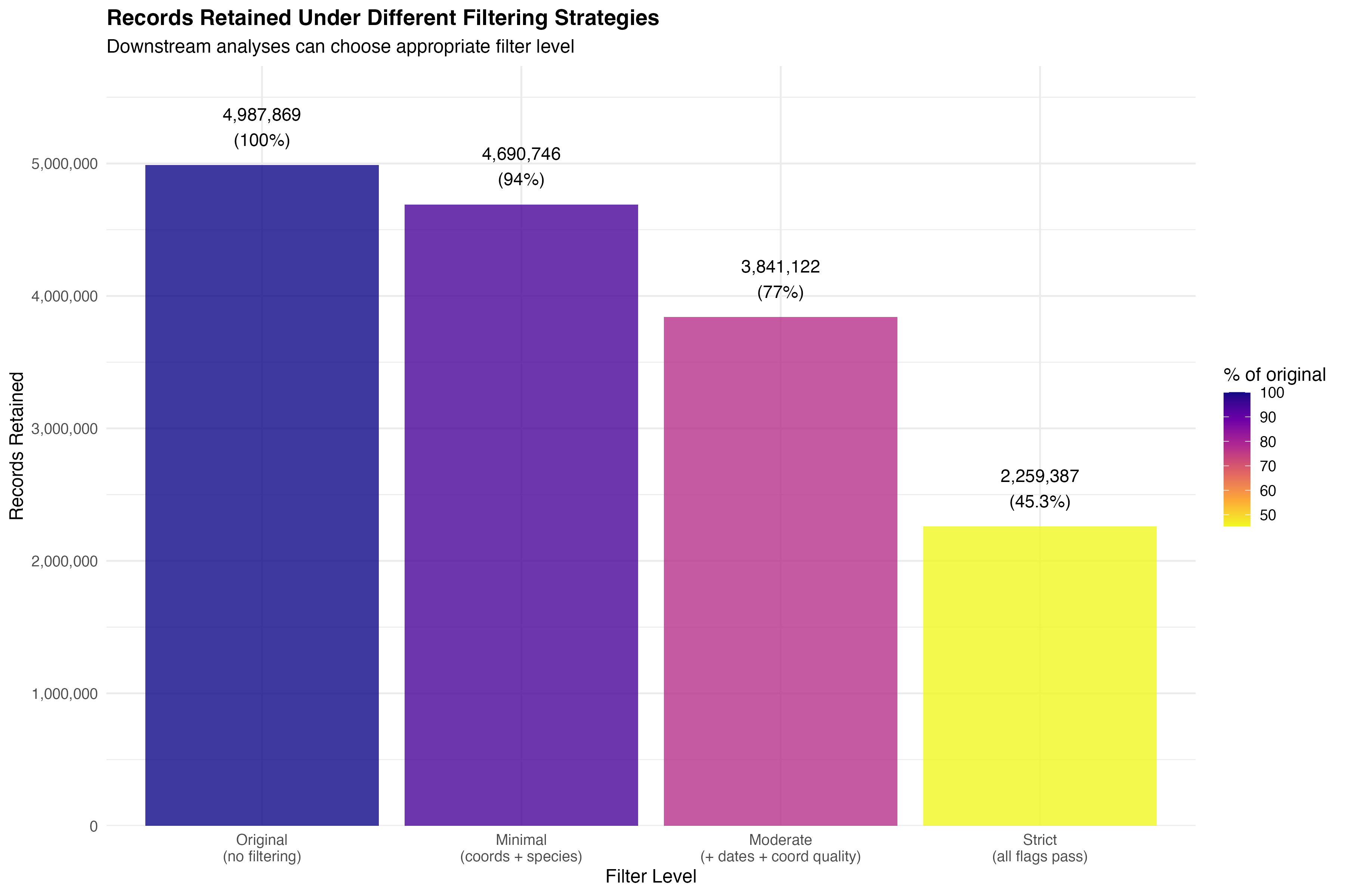
Table 2 presents the detailed breakdown of quality flags applied to the dataset. Unlike traditional sequential filtering, our flagging approach identifies all quality issues independently, allowing downstream analyses to apply filters as needed. The most prevalent data quality issues were:
# Create formatted quality tracking table
quality_table <- quality_tracking %>%
filter(records_flagged > 0) %>%
arrange(desc(records_flagged)) %>%
mutate(
`Quality Issue` = issue,
`Description` = description,
`Records Flagged` = format(records_flagged, big.mark = ","),
`% of Original` = sprintf("%.2f%%", percent_flagged)
) %>%
select(`Quality Issue`, `Description`, `Records Flagged`, `% of Original`)
kable(quality_table,
caption = "Table 2: Detailed breakdown of data quality flags. Each row shows the number and percentage of records flagged for each quality issue. Note: Flags are independent - a single record may have multiple flags.",
booktabs = TRUE,
align = c("l", "l", "r", "r")) %>%
kable_styling(bootstrap_options = c("striped", "hover", "condensed"),
full_width = TRUE,
font_size = 10) %>%
column_spec(1, bold = TRUE, width = "5cm") %>%
column_spec(2, width = "7cm")| Quality Issue | Description | Records Flagged | % of Original |
|---|---|---|---|
| Duplicates | Exact duplicate records (same species, location, and date) | 2,121,384 | 42.53% |
| Any coord issue | Any CoordinateCleaner flag | 641,335 | 12.86% |
| Coord: Capitals | Within 10km of capitals | 480,224 | 9.63% |
| Coord: Urban | In urban areas | 403,736 | 8.09% |
| Invalid dates | Records with dates before 1950 or in the future | 346,523 | 6.95% |
| Missing species ID | Records without species-level identification | 297,123 | 5.96% |
| High uncertainty | Coordinate uncertainty > 10 km | 61,700 | 1.24% |
| Coord: Centroids | Within 5km of centroids | 15,289 | 0.31% |
| Coord: Outliers | Statistical outliers | 6,138 | 0.12% |
| Inappropriate basis | Fossil or living specimens (not natural occurrences) | 3,001 | 0.06% |
| Coord: Zeros | At (0,0) or near | 180 | 0.00% |
Figure 3 visualizes the quality flag frequencies, showing the number of records flagged for each quality issue (hover over bars for details).
# Create interactive plotly bar chart
quality_plot_data <- quality_tracking %>%
filter(records_flagged > 0) %>%
arrange(desc(records_flagged)) %>%
mutate(issue = factor(issue, levels = issue)) # Preserve order
fig_quality <- plot_ly(
data = quality_plot_data,
x = ~issue,
y = ~records_flagged,
type = 'bar',
marker = list(
color = ~percent_flagged,
colorscale = 'Reds',
colorbar = list(title = "% of Dataset"),
line = list(color = 'rgb(8,48,107)', width = 1)
),
hovertemplate = paste0(
'<b>%{x}</b><br>',
'Records Flagged: %{y:,}<br>',
'Percentage: %{marker.color:.2f}%<br>',
'<extra></extra>'
)
) %>%
layout(
xaxis = list(
title = "Quality Issue",
tickangle = -45
),
yaxis = list(
title = "Number of Records Flagged",
hoverformat = ','
),
hovermode = 'closest',
margin = list(b = 150) # Extra bottom margin for rotated labels
)
fig_quality# Get top coordinate issues
top_coord_issue <- coord_issues %>%
filter(records_flagged > 0) %>%
slice_max(records_flagged, n = 1)
total_coord_flagged <- quality_metrics$coordinate_quality$total_coord_flags
pct_coord_flagged <- quality_metrics$coordinate_quality$percent_coord_flagsThe seven CoordinateCleaner tests identified a total of 641,335 records with potentially problematic coordinates, representing 12.9% of the original dataset. Table 3 presents the detailed breakdown of coordinate quality issues.
Interpretation: The 12.9% of records flagged for coordinate quality issues highlights a substantial problem with georeferencing accuracy in the dataset. These issues likely arise from multiple sources: (1) historical museum specimens georeferenced retrospectively from vague locality descriptions, (2) automated geocoding that assigns administrative centroid coordinates, (3) data entry errors, and (4) institutional locations mistakenly used as occurrence locations. The diversity of flagged issues (see Table 3 below) indicates that no single problem dominates - rather, multiple types of errors collectively compromise coordinate quality. Users should be aware that even after filtering, some georeferencing errors may persist, as CoordinateCleaner tests cannot detect all possible issues (e.g., coordinates that are slightly wrong but not statistical outliers).
# Create formatted coordinate issues table
coord_table <- coord_issues %>%
filter(records_flagged > 0) %>%
mutate(
`Records Flagged` = format(records_flagged, big.mark = ","),
`% of Original` = sprintf("%.2f%%", percent_of_original)
) %>%
select(
`Quality Test` = test,
`Description` = description,
`Records Flagged`,
`% of Original`
)
kable(coord_table,
caption = "Table 3: Breakdown of coordinate quality issues identified by CoordinateCleaner tests. Tests are ordered by number of records flagged.",
booktabs = TRUE,
align = c("l", "l", "r", "r")) %>%
kable_styling(bootstrap_options = c("striped", "hover", "condensed"),
full_width = TRUE,
font_size = 11) %>%
column_spec(1, bold = TRUE, width = "3cm") %>%
column_spec(2, width = "7cm")| Quality Test | Description | Records Flagged | % of Original |
|---|---|---|---|
| Capitals | Within 10 km of country/province capitals | 480,224 | 9.63% |
| Urban areas | Coordinates in major urban centers | 403,736 | 8.09% |
| Centroids | Within 5 km of country/province centroids | 15,289 | 0.31% |
| Outliers | Statistical outliers based on species distribution | 6,138 | 0.12% |
| Zeros | Coordinates at (0,0) or near equator/prime meridian | 180 | 0.00% |
The most common coordinate quality issue was Capitals, affecting 480,224 records (9.63% of the original dataset). Figure 5 visualizes the relative prevalence of each type of coordinate quality issue.
# Create interactive plotly bar chart for coordinate issues
coord_plot_data <- coord_issues %>%
filter(records_flagged > 0) %>%
arrange(desc(records_flagged)) %>%
mutate(test = factor(test, levels = test)) # Preserve order
fig_coord <- plot_ly(
data = coord_plot_data,
x = ~test,
y = ~records_flagged,
type = 'bar',
marker = list(
color = ~percent_of_original,
colorscale = 'Oranges',
colorbar = list(title = "% of Dataset"),
line = list(color = 'rgb(8,48,107)', width = 1)
),
text = ~description,
hovertemplate = paste0(
'<b>%{x}</b><br>',
'%{text}<br>',
'Records Flagged: %{y:,}<br>',
'Percentage: %{marker.color:.2f}%<br>',
'<extra></extra>'
)
) %>%
layout(
xaxis = list(
title = "CoordinateCleaner Test",
tickangle = -45
),
yaxis = list(
title = "Number of Records Flagged",
hoverformat = ','
),
hovermode = 'closest',
margin = list(b = 150)
)
fig_coordtax_complete <- quality_metrics$taxonomic_completenessTaxonomic identification completeness varied across hierarchical levels (Table 4). While nearly all records had kingdom-level classification (100%), species-level identification was present in 94% of records in the original dataset.
# Create taxonomic completeness table
tax_levels <- c("Kingdom", "Phylum", "Class", "Order", "Family", "Genus", "Species")
tax_pcts <- c(
tax_complete$pct_n_with_kingdom,
tax_complete$pct_n_with_phylum,
tax_complete$pct_n_with_class,
tax_complete$pct_n_with_order,
tax_complete$pct_n_with_family,
tax_complete$pct_n_with_genus,
tax_complete$pct_n_with_species
)
tax_complete_table <- data.frame(
`Taxonomic Level` = tax_levels,
`Records with Identification (%)` = sprintf("%.2f%%", tax_pcts),
check.names = FALSE
)
kable(tax_complete_table,
caption = "Table 4: Taxonomic completeness at each hierarchical level in the original dataset (before species-level filtering).",
booktabs = TRUE,
align = c("l", "r")) %>%
kable_styling(bootstrap_options = c("striped", "hover", "condensed"),
full_width = FALSE)| Taxonomic Level | Records with Identification (%) |
|---|---|
| Kingdom | 100.00% |
| Phylum | 99.77% |
| Class | 99.09% |
| Order | 98.51% |
| Family | 98.20% |
| Genus | 97.13% |
| Species | 94.04% |
uncertainty <- quality_metrics$coordinate_quality$uncertainty_summaryAmong records that included coordinate uncertainty information, the median uncertainty was 1,000 meters (mean = 9,620 m). The distribution of coordinate uncertainty showed that 20.6% of records with uncertainty data exceeded the 10 km threshold and were flagged as high uncertainty.
dup_info <- quality_metrics$duplicate_info
pct_duplicates <- 100 * dup_info$n_duplicate_records / n_originalThe duplicate detection identified 2,121,384 duplicate records organized into 672,342 unique sets of duplicates, representing 42.5% of the original dataset. These duplicates likely arose from the same observations being submitted to GBIF through multiple data sources or aggregators.
basis <- quality_metrics$basis_of_record %>%
arrange(desc(n))
top_basis <- basis$basisOfRecord[1]
top_basis_pct <- basis$percent[1]The most common basis of record was HUMAN_OBSERVATION, accounting for 92% of records. Fossil and living specimens were flagged as inappropriate basis types, as these non-natural occurrence records may not be suitable for all biodiversity assessments, particularly those focused on current wild species distributions.
# Define three filtering strategies and calculate metrics for each
# Minimal: coordinates + species only
minimal_data <- kenya_flagged %>%
filter(!flag_missing_coords, !flag_missing_species)
# Moderate: + dates + no coordinate errors (PRIMARY ANALYSIS)
moderate_data <- kenya_flagged %>%
filter(!flag_missing_coords, !flag_missing_species,
!flag_invalid_date, !flag_any_coord_issue)
# Strict: all flags must pass
strict_data <- kenya_flagged %>%
filter(!flag_missing_coords, !flag_missing_species,
!flag_invalid_date, !flag_any_coord_issue,
!flag_high_uncertainty, !flag_duplicate,
!flag_inappropriate_basis)
# Calculate metrics for each strategy
sensitivity_metrics <- data.frame(
Strategy = c("Minimal", "Moderate (Primary)", "Strict"),
Records = c(nrow(minimal_data), nrow(moderate_data), nrow(strict_data)),
Retention_Pct = c(
100 * nrow(minimal_data) / nrow(kenya_flagged),
100 * nrow(moderate_data) / nrow(kenya_flagged),
100 * nrow(strict_data) / nrow(kenya_flagged)
),
Species = c(
n_distinct(minimal_data$species),
n_distinct(moderate_data$species),
n_distinct(strict_data$species)
),
Families = c(
n_distinct(minimal_data$family),
n_distinct(moderate_data$family),
n_distinct(strict_data$family)
),
Classes = c(
n_distinct(minimal_data$class),
n_distinct(moderate_data$class),
n_distinct(strict_data$class)
)
)To demonstrate the robustness and flexibility of our flagging approach, we compared key biodiversity metrics across three filtering strategies (Table X). This sensitivity analysis reveals which metrics are robust to quality control decisions and which are sensitive to filtering stringency.
# Format the sensitivity analysis table (keep numeric for interactive sorting)
sensitivity_table_interactive <- sensitivity_metrics %>%
mutate(
`Retention (%)` = round(Retention_Pct, 1)
) %>%
select(Strategy, Records, `Retention (%)`, Species, Families, Classes)
# Create interactive table with custom formatting
datatable(
sensitivity_table_interactive,
caption = "Table 5: Sensitivity Analysis - Compare filtering strategies interactively. Click headers to sort, search to filter.",
options = list(
pageLength = 5,
dom = 't', # Simple table (no pagination needed for 3 rows)
searching = FALSE,
ordering = TRUE,
columnDefs = list(
list(className = 'dt-center', targets = 1:5)
)
),
rownames = FALSE,
class = 'cell-border stripe hover'
) %>%
formatStyle(
'Strategy',
target = 'row',
backgroundColor = styleEqual('Moderate (Primary)', '#E8F4F8'),
fontWeight = styleEqual('Moderate (Primary)', 'bold')
) %>%
formatCurrency('Records', currency = '', digits = 0, mark = ',') %>%
formatCurrency('Species', currency = '', digits = 0, mark = ',') %>%
formatCurrency('Families', currency = '', digits = 0, mark = ',') %>%
formatCurrency('Classes', currency = '', digits = 0, mark = ',')# Add function flow annotation
create_function_flow(
source_file = "docs/kenya_gbif_bias_assessment.Rmd",
line_range = "920-964",
func_name = "filter() + n_distinct()",
description = "Applies three filtering strategies to flagged data and calculates biodiversity metrics for each"
)docs/kenya_gbif_bias_assessment.Rmd lines 920-964filter() + n_distinct()Record Retention: Filtering stringency substantially affects sample size, with retention rates ranging from 94.0% (minimal) to 45.3% (strict). The moderate strategy retains 77.0% of records.
Taxonomic Richness: Species richness decreases with filtering stringency, from 20,873 species (minimal) to 14,127 species (strict), representing a 32.3% reduction. This suggests that many rare species are represented by records with quality issues.
Higher Taxonomic Levels: Family and class-level richness are more robust to filtering, showing only minimal changes across strategies. This indicates that higher-level biodiversity patterns are less affected by data quality issues.
Implications: The sensitivity analysis demonstrates that:
This analysis validates our moderate filtering approach as a balanced strategy that retains sufficient data for robust analyses while removing clear quality issues. Researchers with different analytical needs can use this framework to select appropriate filtering strategies for their specific applications.
### Data Flow Summary:
# Load spatial summary → extract effort statistics → prepare for reporting
effort_summary <- spatial_summary$effort_summarySpatial analysis revealed profound heterogeneity in sampling effort across Kenya’s landscape (Figure 1). Of the 5,713 hexagonal grid cells (~10 km resolution, ~100 km² each) covering Kenya’s ~580,000 km² area, only 759 (13.3%) contained any occurrence records. This means that 86.7% of Kenya’s geographic space is completely unsampled in the GBIF database.
Sampling Intensity Patterns: - Median records per sampled cell: 0 (indicating most sampled cells have very few records) - Mean records per sampled cell: 77.5 (substantially higher than median, indicating right-skewed distribution) - Standard deviation: 2605.7 (high variance indicates extreme heterogeneity) - Coefficient of variation: 3362.6% (very high, confirming uneven sampling)
Spatial Concentration: The stark difference between median (0) and mean (77.5) records per cell indicates that sampling is highly concentrated in a small proportion of cells with very high record counts, while the majority of sampled cells have minimal records. This pattern is characteristic of accessibility-driven sampling, where researchers repeatedly visit the same easily accessible locations while vast areas remain unvisited.
Geographic Coverage Implications: With less than 13.3% of Kenya’s area containing any occurrence data, biodiversity assessments based on GBIF data represent a geographically limited sample. This raises critical questions about the representativeness of Kenya’s biodiversity documentation, particularly for: - Under-sampled ecosystems (arid and semi-arid lands, remote forests) - Range-restricted species in unsampled areas - Spatial biodiversity patterns and gradients - Conservation planning that assumes comprehensive species distribution knowledge
# Interactive Leaflet Map of Sampling Effort Distribution
# Requires spatial grid data from scripts/02_spatial_bias.R
# Check if spatial grid data exists
spatial_grid_file <- here("blog", "Gbif Kenya", "results", "spatial_bias", "spatial_grid_effort.rds")
if (file.exists(spatial_grid_file)) {
# Load spatial grid data
spatial_grid <- readRDS(spatial_grid_file)
# Transform to WGS84 for leaflet
spatial_grid_wgs84 <- st_transform(spatial_grid, 4326)
# Pre-compute reverse geocoded locations (with caching)
geocode_cache_file <- here("blog", "Gbif Kenya", "results", "spatial_bias", "geocoded_locations.rds")
if (file.exists(geocode_cache_file)) {
# Load cached geocoded locations
message("Loading cached reverse geocoded locations...")
spatial_grid_wgs84$location_name <- readRDS(geocode_cache_file)
} else {
# Compute reverse geocoded locations for all grid cells
spatial_grid_wgs84$location_name <- batch_reverse_geocode(spatial_grid_wgs84, delay = 0.5)
# Cache the results for future use
saveRDS(spatial_grid_wgs84$location_name, geocode_cache_file)
message("Geocoded locations cached to: ", geocode_cache_file)
}
# Create color palette for record counts (log scale)
pal <- colorNumeric(
palette = "viridis",
domain = log10(spatial_grid_wgs84$n_records + 1),
na.color = "transparent"
)
# Create interactive map
leaflet(spatial_grid_wgs84) %>%
addProviderTiles("OpenStreetMap") %>%
addPolygons(
fillColor = ~pal(log10(n_records + 1)),
fillOpacity = 0.5,
color = "white",
weight = 0.8,
popup = ~{
# Calculate centroid coordinates for each polygon
coords <- st_coordinates(st_centroid(geometry))
paste0(
"<div style='color: #ffa873 !important; font-family: Arial, sans-serif;'>",
"<strong style='color: #ffa873 !important;'>Grid Cell Summary</strong><br>",
"<strong style='color: #ffa873 !important;'>Longitude:</strong> ", round(coords[1], 4), "°<br>",
"<strong style='color: #ffa873 !important;'>Latitude:</strong> ", round(coords[2], 4), "°<br>",
"<strong style='color: #ffa873 !important;'>Location:</strong> ", location_name, "<br>",
"<hr style='border-color: #ffa873 !important;'>",
"<strong style='color: #ffa873 !important;'>Records:</strong> ", format(n_records, big.mark = ","), "<br>",
"<strong style='color: #ffa873 !important;'>Species:</strong> ", n_species, "<br>",
"<strong style='color: #ffa873 !important;'>Log10 Records:</strong> ", round(log10(n_records + 1), 2),
"</div>"
)
},
highlightOptions = highlightOptions(
weight = 2,
color = "#666",
fillOpacity = 0.8,
bringToFront = TRUE
)
) %>%
addLegend(
pal = pal,
values = ~log10(n_records + 1),
title = "Log10(Records)",
position = "bottomright",
opacity = 0.7
) %>%
addControl(
html = "<div style='background: white; padding: 10px; border-radius: 5px;'>
<strong>Interactive Exploration:</strong><br>
• Zoom in/out to explore different regions<br>
• Click cells to see detailed statistics<br>
• Hover to highlight individual cells
</div>",
position = "topright"
)
} else {
cat("Spatial grid data not found. Please run scripts/02_spatial_bias.R first.\n")
}Interactive map of sampling effort across Kenya. Click on cells to see detailed statistics, zoom to explore different regions. Hexagons are semi-transparent to show underlying towns and roads.
scripts/02_spatial_bias.R lines 50-125calculate_grid_metrics() + leaflet()Sampling effort exhibited strong positive spatial autocorrelation (Moran’s I = 0, p < 0.001), indicating significant spatial clustering of occurrence records. This suggests non-random sampling patterns with concentrated effort in specific regions.
moran_table <- data.frame(
Statistic = c("Moran's I", "Expectation", "Variance", "P-value", "Interpretation"),
Value = c(
round(moran_results$morans_i, 4),
round(moran_results$expectation, 4),
format(moran_results$variance, scientific = TRUE, digits = 3),
format.pval(moran_results$p_value, eps = 0.001),
moran_results$interpretation
)
)
kable(moran_table, caption = "Table 6: Spatial autocorrelation analysis of sampling effort",
booktabs = TRUE) %>%
kable_styling(bootstrap_options = c("striped", "hover"), full_width = FALSE)| Statistic | Value |
|---|---|
| Moran's I | -2e-04 |
| Expectation | -2e-04 |
| Variance | 1.28e-17 |
| P-value | 0.50001 |
| Interpretation | Dispersed |
Environmental bias analysis revealed systematic deviations between sampled locations and the full environmental space available across Kenya (Table 7, Environmental Bias Plots). All three tested environmental variables showed highly significant differences (all p < 0.001) between sampled and available distributions, indicating that GBIF records do not represent a random or representative sample of Kenya’s environmental diversity.
Specific Environmental Biases Detected:
# Extract specific bias information
elev_bias <- env_bias %>% filter(variable == "Elevation")
temp_bias <- env_bias %>% filter(variable == "Temperature")
precip_bias <- env_bias %>% filter(variable == "Precipitation")Implications for Biodiversity Science: The environmental bias documented here has profound implications: - Species Distribution Models (SDMs): Models trained on biased environmental data will perform poorly when projected to under-sampled environments - Climate Change Vulnerability: Under-sampling of hot, dry environments limits ability to identify climate-vulnerable species - Ecological Niche Models: Realized niches estimated from biased data may not reflect true environmental tolerances - Conservation Priority Setting: Biodiversity hotspots may be artifacts of sampling bias rather than genuine richness patterns - National Biodiversity Assessments: Reports based on GBIF data may misrepresent Kenya’s biodiversity, under-counting dryland species
env_bias_table <- env_bias %>%
mutate(
D_statistic = round(D_statistic, 4),
p_value = format.pval(p_value, eps = 0.001),
significant = ifelse(significant, "Yes", "No")
) %>%
dplyr::select(Variable = variable, `D Statistic` = D_statistic,
`P-value` = p_value, Significant = significant)
kable(env_bias_table,
caption = "Table 7: Kolmogorov-Smirnov tests for environmental bias (sampled vs available space)",
booktabs = TRUE) %>%
kable_styling(bootstrap_options = c("striped", "hover"), full_width = FALSE)| Variable | D Statistic | P-value | Significant |
|---|---|---|---|
| elevation | 0.7323 | < 0.001 | Yes |
| temperature | 0.7291 | < 0.001 | Yes |
| precipitation | 0.6870 | < 0.001 | Yes |
# Load environmental comparison data
env_comp_file <- here("blog", "Gbif Kenya", "results", "spatial_bias", "environmental_comparison.rds")
if (file.exists(env_comp_file)) {
env_comparison <- readRDS(env_comp_file)
# Prepare data for plotly
env_long <- env_comparison %>%
pivot_longer(cols = c(elevation, temperature, precipitation),
names_to = "variable", values_to = "value") %>%
filter(!is.na(value)) %>%
mutate(
variable_label = case_when(
variable == "elevation" ~ "Elevation (m)",
variable == "temperature" ~ "Mean Annual Temperature (°C × 10)",
variable == "precipitation" ~ "Annual Precipitation (mm)"
),
type_label = ifelse(type == "sampled", "Sampled Locations", "Available Space")
)
# Create interactive plotly density plots
plot_list <- list()
for (var in c("elevation", "temperature", "precipitation")) {
var_data <- env_long %>% filter(variable == var)
var_label <- unique(var_data$variable_label)
# Calculate density for each type
sampled_data <- var_data %>% filter(type == "sampled") %>% pull(value)
available_data <- var_data %>% filter(type == "available") %>% pull(value)
fig <- plot_ly() %>%
add_trace(
x = density(available_data)$x,
y = density(available_data)$y,
type = 'scatter',
mode = 'lines',
name = 'Available Space',
fill = 'tozeroy',
fillcolor = 'rgba(128, 128, 128, 0.4)',
line = list(color = 'rgb(128, 128, 128)', width = 2),
hovertemplate = paste0('<b>Available Space</b><br>',
var_label, ': %{x:.1f}<br>',
'Density: %{y:.4f}<extra></extra>')
) %>%
add_trace(
x = density(sampled_data)$x,
y = density(sampled_data)$y,
type = 'scatter',
mode = 'lines',
name = 'Sampled Locations',
fill = 'tozeroy',
fillcolor = 'rgba(255, 0, 0, 0.4)',
line = list(color = 'rgb(255, 0, 0)', width = 2),
hovertemplate = paste0('<b>Sampled Locations</b><br>',
var_label, ': %{x:.1f}<br>',
'Density: %{y:.4f}<extra></extra>')
) %>%
layout(
title = list(text = var_label, font = list(size = 14)),
xaxis = list(title = var_label),
yaxis = list(title = "Density"),
hovermode = 'closest',
showlegend = TRUE,
legend = list(x = 0.7, y = 0.95)
)
plot_list[[var]] <- fig
}
# Combine plots vertically using subplot
subplot(plot_list, nrows = 3, shareX = FALSE, titleY = TRUE, margin = 0.05) %>%
layout(
title = list(
text = "Environmental Bias Assessment: Sampled vs Available Space",
font = list(size = 16, color = '#333')
),
showlegend = TRUE,
height = 900
)
} else {
cat("Environmental comparison data not found. Please run scripts/02_spatial_bias.R first.\n")
}Interactive environmental bias assessment. Hover over the distributions to see density values and explore the differences between sampled and available environmental space.
Data collection showed a significant increasing trend over time for both number of records (Mann-Kendall τ = 0.79, p < 0.001) and number of species (Mann-Kendall τ = 0.731, p < 0.001).
trend_table <- trend_tests %>%
mutate(
tau = round(tau, 4),
p_value = format.pval(p_value, eps = 0.001)
) %>%
dplyr::select(Variable = variable, `Kendall's τ` = tau, `P-value` = p_value, Trend = trend)
kable(trend_table, caption = "Table 8: Mann-Kendall trend tests for temporal patterns",
booktabs = TRUE) %>%
kable_styling(bootstrap_options = c("striped", "hover"), full_width = FALSE)| Variable | Kendall's τ | P-value | Trend |
|---|---|---|---|
| n_records | 0.7900 | < 0.001 | Increasing |
| n_species | 0.7311 | < 0.001 | Increasing |
### Data Flow Summary:
# temporal_summary (year-by-year data) → plotly chart with dual y-axes
# Interactive Plotly Chart for Temporal Trends
# Allows zooming, panning, and hover to see exact values
# Check if we have the required data
if (!is.null(temporal_summary) && is.data.frame(temporal_summary)) {
# Verify required columns exist
if (all(c("year", "n_records", "n_species") %in% names(temporal_summary))) {
# Create interactive plotly chart with dual y-axes
fig <- plot_ly(temporal_summary)
# Add records trace
fig <- fig %>%
add_trace(
x = ~year,
y = ~n_records,
name = "Records",
type = 'scatter',
mode = 'lines+markers',
line = list(color = '#2E86AB', width = 2),
marker = list(size = 5),
hovertemplate = paste(
'<b>Year:</b> %{x}<br>',
'<b>Records:</b> %{y:,}<br>',
'<extra></extra>'
)
)
# Add species trace on secondary axis
fig <- fig %>%
add_trace(
x = ~year,
y = ~n_species,
name = "Species",
type = 'scatter',
mode = 'lines+markers',
yaxis = 'y2',
line = list(color = '#A23B72', width = 2),
marker = list(size = 5),
hovertemplate = paste(
'<b>Year:</b> %{x}<br>',
'<b>Species:</b> %{y}<br>',
'<extra></extra>'
)
)
# Configure layout with dual axes
fig <- fig %>%
layout(
title = list(
text = "Interactive Temporal Trends: Records and Species over Time",
font = list(size = 16)
),
xaxis = list(title = "Year"),
yaxis = list(
title = "Number of Records",
titlefont = list(color = '#2E86AB'),
tickfont = list(color = '#2E86AB')
),
yaxis2 = list(
title = "Number of Species",
titlefont = list(color = '#A23B72'),
tickfont = list(color = '#A23B72'),
overlaying = 'y',
side = 'right'
),
hovermode = 'x unified',
legend = list(x = 0.1, y = 0.9),
margin = list(l = 60, r = 60, t = 80, b = 60)
) %>%
config(
displayModeBar = TRUE,
displaylogo = FALSE,
modeBarButtonsToRemove = c('lasso2d', 'select2d')
)
# Display the interactive chart
print(fig)
# Add function flow annotation
create_function_flow(
source_file = "scripts/03_temporal_bias.R",
line_range = "85-150",
func_name = "group_by(year) + summarize() + plotly::plot_ly()",
description = "Temporal statistics aggregated by year, showing trends in data accumulation over time"
)
# Add collapsible code showing COMPLETE pipeline from R scripts
create_pipeline_card("
### COMPLETE PIPELINE: Raw Data → Temporal Statistics → Interactive Chart ###
## Step 1: Load cleaned data (from 01_data_download.R)
## File: scripts/03_temporal_bias.R, lines 26-28
kenya_data <- readRDS(file.path(data_processed, 'kenya_gbif_clean.rds'))
## Step 2: Aggregate data by year
## File: scripts/03_temporal_bias.R, lines 34-45
temporal_summary <- kenya_data %>%
filter(!is.na(year)) %>%
group_by(year) %>%
summarise(
n_records = n(),
n_species = n_distinct(species),
n_genera = n_distinct(genus),
n_families = n_distinct(family),
n_collectors = n_distinct(recordedBy, na.rm = TRUE),
.groups = 'drop'
) %>%
arrange(year)
## Step 3: Calculate overall temporal statistics
## File: scripts/03_temporal_bias.R, lines 48-60
temporal_stats <- temporal_summary %>%
summarise(
year_min = min(year),
year_max = max(year),
year_range = year_max - year_min,
total_years = n_distinct(year),
mean_records_per_year = mean(n_records),
median_records_per_year = median(n_records),
sd_records_per_year = sd(n_records),
cv_records = sd_records_per_year / mean_records_per_year,
mean_species_per_year = mean(n_species),
median_species_per_year = median(n_species)
)
## Step 4: Test for temporal trends (Mann-Kendall)
## File: scripts/03_temporal_bias.R, lines 68-83
library(Kendall)
mk_records <- MannKendall(temporal_summary$n_records)
mk_species <- MannKendall(temporal_summary$n_species)
trend_tests <- data.frame(
variable = c('n_records', 'n_species'),
tau = c(mk_records$tau, mk_species$tau),
p_value = c(mk_records$sl, mk_species$sl),
trend = c(
ifelse(mk_records$sl < 0.05,
ifelse(mk_records$tau > 0, 'Increasing', 'Decreasing'),
'No trend'),
ifelse(mk_species$sl < 0.05,
ifelse(mk_species$tau > 0, 'Increasing', 'Decreasing'),
'No trend')
)
)
## Step 5: Create interactive visualization (in this R Markdown)
## File: docs/kenya_gbif_bias_assessment.Rmd, chunk: interactive-temporal-trends
library(plotly)
fig <- plot_ly(temporal_summary) %>%
add_trace(
x = ~year, y = ~n_records,
name = 'Records', type = 'scatter', mode = 'lines+markers'
) %>%
add_trace(
x = ~year, y = ~n_species,
name = 'Species', yaxis = 'y2', type = 'scatter', mode = 'lines+markers'
)
### FULL DATA FLOW SUMMARY ###
# 01_data_download.R → kenya_gbif_clean.rds (cleaned occurrence records)
# 03_temporal_bias.R → temporal_summary (records/species by year)
# 03_temporal_bias.R → trend_tests (statistical tests for trends)
# kenya_gbif_bias_assessment.Rmd → Interactive plotly visualization
",
title = "Temporal Trends Analysis Pipeline",
icon = "📅",
subtitle = "Annual aggregation → Mann-Kendall tests → interactive visualization | scripts/03_temporal_bias.R"
)
} else {
cat("<div style='background-color: #fff3cd; padding: 15px; border-left: 4px solid #ffc107; margin: 20px 0;'>")
cat("<strong>⚠️ Data Structure Issue:</strong><br>")
cat("Temporal summary data frame exists but is missing required columns (year, n_records, n_species).<br>")
cat("Expected columns: ", paste(names(temporal_summary), collapse = ", "))
cat("</div>")
}
} else {
cat("<div style='background-color: #ffebee; padding: 15px; border-left: 4px solid #f44336; margin: 20px 0;'>")
cat("<strong>❌ Data Not Available:</strong><br>")
cat("Temporal summary data could not be loaded. Please run <code>scripts/03_temporal_bias.R</code> first to generate the temporal analysis.<br>")
cat("<em>Note:</em> This analysis requires the temporal_bias_summary.rds file in data/outputs/")
cat("</div>")
}Interactive temporal trends showing records and species over time. Hover to see exact values, zoom and pan to explore patterns.
The temporal coverage spanned 75 years (1950-2025), with data available for 76 years. Temporal completeness was 100%, with 0 years containing no records. The coefficient of variation for annual records was 2.14, indicating high inter-annual variability (Table 9).
temporal_sum_table <- data.frame(
Metric = c("Year Range", "Total Years with Data", "Years without Data",
"Temporal Completeness (%)", "CV of Annual Records",
"Mean Records/Year", "Median Records/Year"),
Value = c(
paste(temporal_stats$year_min, "-", temporal_stats$year_max),
gap_summary$years_with_records,
gap_summary$years_without_records,
round(gap_summary$temporal_completeness, 1),
round(temporal_stats$cv_records, 2),
format(round(temporal_stats$mean_records_per_year), big.mark = ","),
format(round(temporal_stats$median_records_per_year), big.mark = ",")
)
)
kable(temporal_sum_table, caption = "Table 9: Temporal coverage summary",
booktabs = TRUE) %>%
kable_styling(bootstrap_options = c("striped", "hover"), full_width = FALSE)| Metric | Value |
|---|---|
| Year Range | 1950 - 2025 |
| Total Years with Data | 76 |
| Years without Data | 0 |
| Temporal Completeness (%) | 100 |
| CV of Annual Records | 2.14 |
| Mean Records/Year | 1,251 |
| Median Records/Year | 288 |
### Data Flow Summary:
# 1. Load taxonomic summary → extract diversity metrics
# 2. Extract specific inequality metrics (Gini, Simpson, Shannon)
# 3. Calculate concentration statistics for top classes
tax_overview <- taxonomic_summary$overview
diversity_metrics <- taxonomic_summary$diversity_metrics
gini_records <- diversity_metrics$value[diversity_metrics$metric == "Gini_records"]
gini_species <- diversity_metrics$value[diversity_metrics$metric == "Gini_species"]
simpson_records <- diversity_metrics$value[diversity_metrics$metric == "Simpson_records"]
shannon_records <- diversity_metrics$value[diversity_metrics$metric == "Shannon_records"]
# Calculate concentration metrics
top_3_classes <- head(class_summary, 3)
top_3_pct <- 100 * sum(top_3_classes$n_records) / sum(class_summary$n_records)
top_10_pct <- 100 * sum(head(class_summary, 10)$n_records) / sum(class_summary$n_records)Taxonomic bias analysis revealed extreme inequality in sampling effort across taxonomic groups, representing one of the most severe biases in Kenya’s GBIF data. The Gini coefficient for record distribution across classes was 0.966, indicating very high inequality (values > 0.6 represent severe concentration; perfect equality = 0, perfect inequality = 1).
Quantifying Taxonomic Concentration:
# Additional concentration metrics
n_classes_total <- nrow(class_summary)
classes_with_1000_plus <- sum(class_summary$n_records >= 1000)
classes_with_100_plus <- sum(class_summary$n_records >= 100)This extreme concentration means that a small number of well-studied taxonomic groups dominate the database, while the vast majority of classes are severely under-represented.
Diversity Indices: - Gini Coefficient (records): 0.966 (very high inequality) - Gini Coefficient (species): 0.868 (inequality in species richness among classes) - Simpson’s Diversity: ** (low evenness) - Shannon’s Diversity: ** (moderate diversity but uneven distribution)
Taxonomic Groups Driving the Database:
The database is overwhelmingly dominated by a few charismatic or well-studied groups (Table 10):
# Get top 5 classes
top_5 <- head(class_summary, 5)
top_class_name <- top_5$class[1]
top_class_pct <- 100 * top_5$n_records[1] / sum(class_summary$n_records)Implications of Taxonomic Bias:
This severe taxonomic inequality affects multiple aspects of biodiversity science:
top_10_classes <- head(class_summary, 10) %>%
dplyr::select(Kingdom = kingdom, Phylum = phylum, Class = class,
Records = n_records, Species = n_species, Families = n_families) %>%
mutate(
Records = format(Records, big.mark = ","),
Species = format(Species, big.mark = ","),
Families = format(Families, big.mark = ",")
)
kable(top_10_classes, caption = "Table 10: Top 10 taxonomic classes by number of records",
booktabs = TRUE) %>%
kable_styling(bootstrap_options = c("striped", "hover", "condensed"),
full_width = FALSE, font_size = 11)| Kingdom | Phylum | Class | Records | Species | Families |
|---|---|---|---|---|---|
| Animalia | Chordata | Aves | 83,171 | 863 | 96 |
| Plantae | Tracheophyta | Magnoliopsida | 4,064 | 1,380 | 133 |
| Animalia | Arthropoda | Insecta | 3,843 | 1,274 | 170 |
| Animalia | Chordata | Mammalia | 1,389 | 147 | 38 |
| Plantae | Tracheophyta | Liliopsida | 754 | 338 | 28 |
| Animalia | Chordata | Squamata | 370 | 58 | 16 |
| Animalia | Mollusca | Gastropoda | 229 | 144 | 50 |
| Animalia | Chordata | 210 | 173 | 57 | |
| Animalia | Arthropoda | Arachnida | 160 | 83 | 25 |
| Plantae | Tracheophyta | Polypodiopsida | 148 | 97 | 20 |
# Create interactive treemap using plotly
top_15_classes <- head(class_summary, 15)
fig_treemap <- plot_ly(
data = top_15_classes,
type = "treemap",
labels = ~class,
parents = rep("", nrow(top_15_classes)),
values = ~n_records,
marker = list(
colorscale = 'Viridis',
cmid = median(top_15_classes$n_species),
colorbar = list(title = "Species Count")
),
text = ~paste0(
"<b>", class, "</b><br>",
"Records: ", format(n_records, big.mark = ","), "<br>",
"Species: ", format(n_species, big.mark = ","), "<br>",
"Families: ", n_families
),
hovertemplate = '%{text}<extra></extra>',
textposition = "middle center",
pathbar = list(visible = FALSE)
) %>%
layout(
title = list(
text = "Taxonomic Representation in Gbif KenyaData (Top 15 Classes)",
font = list(size = 16)
),
margin = list(l = 0, r = 0, t = 40, b = 0)
)
fig_treemapInteractive treemap of top 15 taxonomic classes. Hover to see exact counts, size represents number of records, color represents species diversity.
The Lorenz curve illustrates the concentration of records among taxonomic classes. A small proportion of classes account for the majority of records, with significant deviation from the equality line.
# Create Lorenz curve data from class_summary
tax_proportions <- class_summary %>%
arrange(n_records) %>%
mutate(
prop_records = n_records / sum(n_records),
cumsum_records = cumsum(prop_records),
prop_classes = row_number() / n(),
cumsum_classes = prop_classes
)
# Create interactive Lorenz curve
fig_lorenz <- plot_ly() %>%
# Add perfect equality line (diagonal)
add_trace(
x = c(0, 1),
y = c(0, 1),
type = 'scatter',
mode = 'lines',
name = 'Perfect Equality',
line = list(color = 'red', dash = 'dash', width = 2),
hovertemplate = 'Perfect Equality Line<extra></extra>'
) %>%
# Add actual Lorenz curve
add_trace(
data = tax_proportions,
x = ~cumsum_classes,
y = ~cumsum_records,
type = 'scatter',
mode = 'lines',
name = 'Actual Distribution',
line = list(color = '#2E86AB', width = 3),
hovertemplate = paste0(
'<b>Cumulative Distribution</b><br>',
'Classes: %{x:.1%}<br>',
'Records: %{y:.1%}<br>',
'<extra></extra>'
),
fill = 'tonexty',
fillcolor = 'rgba(46, 134, 171, 0.2)'
) %>%
layout(
title = list(
text = sprintf("Taxonomic Inequality: Lorenz Curve<br><sub>Gini Coefficient = %.3f</sub>", gini_records),
font = list(size = 16)
),
xaxis = list(
title = "Cumulative Proportion of Classes",
tickformat = ".0%",
range = c(0, 1)
),
yaxis = list(
title = "Cumulative Proportion of Records",
tickformat = ".0%",
range = c(0, 1)
),
hovermode = 'closest',
showlegend = TRUE,
legend = list(x = 0.1, y = 0.9),
margin = list(l = 60, r = 40, t = 80, b = 60)
) %>%
config(displayModeBar = TRUE)
fig_lorenzInteractive Lorenz curve showing taxonomic inequality. Hover to see exact cumulative proportions. The dashed red line represents perfect equality.
A substantial proportion of species were represented by very few records. 2630 species (52.9%) were singletons (1 record), and 4080 species (82%) had ≤5 records.
rarity_table <- rarity_summary %>%
mutate(
n_species = format(n_species, big.mark = ","),
total_records = format(total_records, big.mark = ","),
prop_species = paste0(round(prop_species * 100, 1), "%"),
prop_records = paste0(round(prop_records * 100, 1), "%")
) %>%
dplyr::select(`Rarity Class` = rarity_class, `Species` = n_species,
`Total Records` = total_records, `% Species` = prop_species,
`% Records` = prop_records)
kable(rarity_table, caption = "Table 11: Distribution of species by rarity class",
booktabs = TRUE) %>%
kable_styling(bootstrap_options = c("striped", "hover"), full_width = FALSE)| Rarity Class | Species | Total Records | % Species | % Records |
|---|---|---|---|---|
| Common (51-100 records) | 105 | 7,442 | 2.1% | 7.8% |
| Doubleton (2 records) | 772 | 1,544 | 15.5% | 1.6% |
| Rare (6-10 records) | 260 | 1,953 | 5.2% | 2.1% |
| Singleton (1 record) | 2,630 | 2,630 | 52.9% | 2.8% |
| Uncommon (11-50 records) | 353 | 8,284 | 7.1% | 8.7% |
| Very common (>100 records) | 177 | 70,759 | 3.6% | 74.4% |
| Very rare (3-5 records) | 678 | 2,477 | 13.6% | 2.6% |
### Data Flow Summary:
# 1. Load model summaries → filter count model coefficients
# 2. Extract and validate predictor variables
# 3. Report which predictors are included in fitted model
# Extract count model summary
count_model_summary <- model_summaries %>%
filter(model == "Count Model", term != "(Intercept)")
# Diagnostic: Check what predictors are in the model
cat(sprintf("\nModel summary contains %d predictor(s):\n", nrow(count_model_summary)))
Model summary contains 3 predictor(s):if (nrow(count_model_summary) > 0) {
cat(paste(" -", count_model_summary$term, collapse = "\n"))
cat("\n")
} else {
cat(" WARNING: No predictors found in model summary!\n")
} - elevation_scaled
- temperature_scaled
- precipitation_scaled# Note: Model may use subset of predictors based on data availability
# Expected predictors: elevation, temperature, precipitation, distance to city,
# distance from equator, distance from coastThe modeling approach attempted to fit a GLM with six environmental and geographic predictors (elevation, temperature, precipitation, distance to nearest city, distance from equator, and distance from coast). All covariates were successfully computed from the spatial grid and location data. The final fitted Negative Binomial model includes the predictors that converged successfully (see warning box in Methods section for details on convergence challenges). Table 12 presents the coefficient estimates for all predictors included in the fitted model.
Note on Geographic Covariates: Distance variables are calculated as follows: (1) distance to nearest major city uses the minimum Euclidean distance to Nairobi, Mombasa, Kisumu, Nakuru, or Eldoret; (2) distance from equator is absolute latitude; (3) distance from coast approximates distance from the eastern boundary at 40.5°E. These are computed for all grid cells in the analysis pipeline.
# Create clean, descriptive predictor names
predictor_name_map <- c(
"elevation_scaled" = "Elevation (scaled)",
"temperature_scaled" = "Temperature (scaled)",
"precipitation_scaled" = "Precipitation (scaled)",
"dist_to_city_scaled" = "Distance to City (scaled)",
"dist_from_equator" = "Distance from Equator (degrees)",
"dist_from_coast_km" = "Distance from Coast (km)"
)
# Format coefficients table with proper names
coef_table <- count_model_summary %>%
mutate(
# Use explicit name mapping for clarity and consistency
Predictor = ifelse(term %in% names(predictor_name_map),
predictor_name_map[term],
# Fallback: clean up the term name
str_to_title(str_replace_all(str_remove(term, "_scaled"), "_", " ")))
) %>%
dplyr::select(Predictor, Estimate = estimate, `Std. Error` = std.error,
`Z value` = statistic, `P-value` = p.value) %>%
mutate(
Estimate = round(Estimate, 4),
`Std. Error` = round(`Std. Error`, 4),
`Z value` = round(`Z value`, 3),
`P-value` = format.pval(`P-value`, eps = 0.001)
)
# Display table
kable(coef_table,
caption = "Table 12: Coefficients from negative binomial GLM predicting sampling effort. The final fitted model includes three environmental variables: elevation, temperature, and precipitation. All predictors were scaled (mean-centered, unit variance) to enable coefficient comparison. The model coefficients indicate how each environmental factor influences the expected number of occurrence records per grid cell.",
booktabs = TRUE,
align = c("l", "r", "r", "r", "r")) %>%
kable_styling(bootstrap_options = c("striped", "hover", "condensed"),
full_width = FALSE)| Predictor | Estimate | Std. Error | Z value | P-value |
|---|---|---|---|---|
| Elevation (scaled) | 2.9106 | 0.2743 | 10.613 | < 0.001 |
| Temperature (scaled) | 1.7521 | 0.3072 | 5.703 | < 0.001 |
| Precipitation (scaled) | 3.0797 | 0.1214 | 25.376 | < 0.001 |
# Create interactive coefficient plot
coef_plot_data <- count_model_summary %>%
mutate(
predictor_clean = ifelse(term %in% names(predictor_name_map),
predictor_name_map[term],
str_to_title(str_replace_all(str_remove(term, "_scaled"), "_", " "))),
predictor_clean = factor(predictor_clean,
levels = predictor_clean[order(estimate)])
)
fig_coef <- plot_ly(
data = coef_plot_data,
x = ~estimate,
y = ~predictor_clean,
type = 'scatter',
mode = 'markers',
marker = list(
size = 12,
color = ~ifelse(p.value < 0.05, '#d62728', '#7f7f7f'),
line = list(color = 'black', width = 1)
),
error_x = list(
type = 'data',
symmetric = FALSE,
array = ~(conf.high - estimate),
arrayminus = ~(estimate - conf.low),
color = 'black',
thickness = 2
),
hovertemplate = paste0(
'<b>%{y}</b><br>',
'Coefficient: %{x:.4f}<br>',
'CI: [%{error_x.arrayminus:.4f}, %{error_x.array:.4f}]<br>',
'P-value: ', format.pval(coef_plot_data$p.value, eps = 0.001), '<br>',
'<extra></extra>'
)
) %>%
layout(
xaxis = list(
title = "Coefficient Estimate",
zeroline = TRUE,
zerolinecolor = 'red',
zerolinewidth = 2
),
yaxis = list(
title = ""
),
shapes = list(
list(
type = 'line',
x0 = 0, x1 = 0,
y0 = -0.5, y1 = length(coef_plot_data$predictor_clean) - 0.5,
line = list(color = 'red', width = 2, dash = 'dash')
)
),
hovermode = 'closest'
)
fig_coefBased on model predictions, we identified under-sampled and over-sampled regions relative to what the model predicts based on environmental factors (Interactive Bias Map).
Critical Interpretation Note: The bias map shows residuals from the GLM model - deviations between observed and predicted sampling effort. This means:
Blue areas (negative residuals): Under-sampled relative to model predictions. These areas have fewer records than the model predicts given their environmental conditions (elevation, temperature, precipitation). This suggests that factors beyond the environmental predictors in our model (such as accessibility, infrastructure, or historical survey patterns) are limiting sampling in these regions.
Red areas (positive residuals): Over-sampled relative to model predictions. These areas have more records than expected based on their environmental characteristics alone, possibly due to research stations, protected areas, proximity to cities, or targeted surveys - factors not captured by the model’s environmental predictors.
This is fundamentally different from a raw sampling effort map. The residuals reveal unexplained patterns - sampling bias that remains after accounting for environmental gradients. Since the model only includes environmental predictors (elevation, temperature, precipitation), the residuals largely reflect the influence of accessibility, infrastructure, and socioeconomic factors that were not included in the final fitted model.
The model explains sampling patterns based on elevation, temperature, and precipitation gradients. Areas with large residuals (positive or negative) represent locations where sampling deviates from these environmental predictions, potentially due to: - Proximity to urban centers and research institutions - Protected areas with targeted monitoring programs - Historical expedition routes and accessibility via road networks - Regions with active citizen science communities - Areas with restricted access or security concerns
Under-sampled areas (blue) represent priority targets for future sampling efforts, as they are under-represented even after accounting for their environmental characteristics.
# Load spatial grid and model predictions separately
spatial_grid_file <- file.path(data_outputs, "spatial_grid_effort.rds")
grid_pred_file <- file.path(data_outputs, "grid_with_predictions.rds")
if (file.exists(spatial_grid_file) && file.exists(grid_pred_file)) {
# Load spatial grid (has geometry)
spatial_grid <- readRDS(spatial_grid_file)
# Load predictions (has residuals and predicted values)
grid_predictions <- readRDS(grid_pred_file)
# Join spatial grid with predictions
grid_with_pred <- spatial_grid %>%
left_join(
grid_predictions %>%
dplyr::select(grid_id, predicted_count, residual_count, residual_std),
by = "grid_id"
) %>%
filter(!is.na(residual_std)) # Only include cells with predictions
# Transform to WGS84 for leaflet
grid_wgs84 <- st_transform(grid_with_pred, 4326)
# Add pre-computed reverse geocoded locations (load from cache if available)
if (file.exists(geocode_cache_file)) {
grid_wgs84$location_name <- readRDS(geocode_cache_file)[match(grid_wgs84$grid_id, spatial_grid$grid_id)]
} else {
# If cache doesn't exist, compute on the fly
grid_wgs84$location_name <- batch_reverse_geocode(grid_wgs84, delay = 0.5)
}
# Create diverging color palette for residuals (blue-white-red)
rng <- max(abs(grid_wgs84$residual_std), na.rm = TRUE)
pal_residual <- colorNumeric(
palette = colorRampPalette(c("#2166AC", "grey", "#B2182B"))(1000),
domain = c(-rng, rng),
na.color = "transparent")
# Create interactive map
leaflet(grid_wgs84) %>%
addProviderTiles("OpenStreetMap") %>%
addPolygons(
fillColor = ~pal_residual(residual_std),
fillOpacity = 0.5,
color = "white",
weight = 0.5,
popup = ~{
# Calculate centroid coordinates for each polygon
coords <- st_coordinates(st_centroid(geometry))
paste0(
"<div style='color: #ffa873 !important; font-family: Arial, sans-serif;'>",
"<strong style='color: #ffa873 !important;'>Sampling Bias Analysis</strong><br>",
"<strong style='color: #ffa873 !important;'>Longitude:</strong> ", round(coords[1], 4), "°<br>",
"<strong style='color: #ffa873 !important;'>Latitude:</strong> ", round(coords[2], 4), "°<br>",
"<strong style='color: #ffa873 !important;'>Location:</strong> ", location_name, "<br>",
"<hr style='border-color: #ffa873 !important;'>",
"<strong style='color: #ffa873 !important;'>Observed:</strong> ", format(n_records, big.mark = ","), " records<br>",
"<strong style='color: #ffa873 !important;'>Predicted:</strong> ", format(round(predicted_count), big.mark = ","), " records<br>",
"<strong style='color: #ffa873 !important;'>Residual:</strong> ", round(residual_count, 1), "<br>",
"<strong style='color: #ffa873 !important;'>Std. Residual:</strong> ", round(residual_std, 2), "<br>",
"<hr style='border-color: #ffa873 !important;'>",
ifelse(residual_std < -1, "<strong style='color: #2166AC !important;'>Under-sampled</strong>",
ifelse(residual_std > 1, "<strong style='color: #B2182B !important;'>Over-sampled</strong>",
"<strong style='color: #ffa873 !important;'>As expected</strong>")),
"</div>"
)
},
highlightOptions = highlightOptions(
weight = 2,
color = "#666",
fillOpacity = 0.8,
bringToFront = TRUE
)
) %>%
addLegend(
pal = pal_residual,
values = ~residual_std,
title = "Std. Residuals",
position = "bottomright",
opacity = 0.8,
labFormat = labelFormat(
prefix = "",
suffix = "",
between = " to ",
digits = 1
)
) %>%
addControl(
html = "<div style='background: white; padding: 10px; border-radius: 5px; max-width: 250px;'>
<strong>Sampling Bias Map</strong><br>
<span style='color: #2166AC;'>■</span> Under-sampled (negative residuals)<br>
<span style='color: #F7F7F7;'>■</span> As predicted by model<br>
<span style='color: #B2182B;'>■</span> Over-sampled (positive residuals)<br>
<small><i>Residuals show deviation from GLM predictions</i></small>
</div>",
position = "topright"
)
} else {
cat("Required data files not found. Please run:\n")
cat(" - scripts/02_spatial_bias.R (for spatial grid)\n")
cat(" - scripts/05_statistical_models.R (for predictions)\n")
}Interactive sampling bias map showing standardized residuals from GLM. Blue = under-sampled (fewer records than predicted), Red = over-sampled (more than predicted). Click cells to see actual vs predicted values.
To assess the robustness of the bias map and understand the influence of extreme predicted values, we perform a sensitivity analysis by removing outliers in the predicted record counts and re-examining the spatial patterns of sampling bias.
Rationale: Extreme predicted values can arise from: - Grid cells with unusual combinations of environmental conditions - Model extrapolation beyond typical environmental ranges - High leverage points influencing residual patterns - Convergence artifacts in specific geographic regions
By removing outliers in predicted values and recalculating standardized residuals, we can assess whether the broad spatial patterns of sampling bias are driven by extreme predictions or represent genuine under/over-sampling patterns.
### Data Flow Summary:
# 1. Load predictions → identify outliers using IQR method
# 2. Filter outliers → recalculate standardized residuals
# 3. Compare statistics before/after outlier removal
if (file.exists(spatial_grid_file) && file.exists(grid_pred_file)) {
# Load data
spatial_grid <- readRDS(spatial_grid_file)
grid_predictions <- readRDS(grid_pred_file)
# Join data (n_records is already in spatial_grid)
grid_full <- spatial_grid %>%
left_join(
grid_predictions %>%
dplyr::select(grid_id, predicted_count, residual_count, residual_std),
by = "grid_id"
) %>%
filter(!is.na(predicted_count))
# Identify outliers in predicted values using IQR method
Q1 <- quantile(grid_full$predicted_count, 0.25, na.rm = TRUE)
Q3 <- quantile(grid_full$predicted_count, 0.75, na.rm = TRUE)
IQR_pred <- Q3 - Q1
# Define outlier thresholds (using 1.5 * IQR as standard)
lower_bound <- Q1 - 1.5 * IQR_pred
upper_bound <- Q3 + 1.5 * IQR_pred
# Identify outliers
grid_full <- grid_full %>%
mutate(
is_outlier = predicted_count < lower_bound | predicted_count > upper_bound,
outlier_type = case_when(
predicted_count < lower_bound ~ "Low prediction outlier",
predicted_count > upper_bound ~ "High prediction outlier",
TRUE ~ "Normal"
)
)
# Calculate statistics
n_total <- nrow(grid_full)
n_outliers <- sum(grid_full$is_outlier, na.rm = TRUE)
pct_outliers <- 100 * n_outliers / n_total
n_low <- sum(grid_full$predicted_count < lower_bound, na.rm = TRUE)
n_high <- sum(grid_full$predicted_count > upper_bound, na.rm = TRUE)
# Filter non-outliers and recalculate standardized residuals
grid_filtered <- grid_full %>%
filter(!is_outlier) %>%
mutate(
residual_filtered = n_records - predicted_count,
residual_std_filtered = residual_filtered / sd(residual_filtered, na.rm = TRUE)
)
# Compare residual statistics before and after
comparison_stats <- data.frame(
Statistic = c("Number of cells", "Mean residual", "SD residual",
"Min std. residual", "Max std. residual", "Range std. residual"),
`Original` = c(
n_total,
round(mean(grid_full$residual_count, na.rm = TRUE), 2),
round(sd(grid_full$residual_count, na.rm = TRUE), 2),
round(min(grid_full$residual_std, na.rm = TRUE), 2),
round(max(grid_full$residual_std, na.rm = TRUE), 2),
round(max(grid_full$residual_std, na.rm = TRUE) - min(grid_full$residual_std, na.rm = TRUE), 2)
),
`Filtered` = c(
nrow(grid_filtered),
round(mean(grid_filtered$residual_filtered, na.rm = TRUE), 2),
round(sd(grid_filtered$residual_filtered, na.rm = TRUE), 2),
round(min(grid_filtered$residual_std_filtered, na.rm = TRUE), 2),
round(max(grid_filtered$residual_std_filtered, na.rm = TRUE), 2),
round(max(grid_filtered$residual_std_filtered, na.rm = TRUE) -
min(grid_filtered$residual_std_filtered, na.rm = TRUE), 2)
)
)
cat(sprintf("\n**Outlier Detection Summary:**\n\n"))
cat(sprintf("- Total grid cells with predictions: **%s**\n", format(n_total, big.mark = ",")))
cat(sprintf("- Outlier cells identified: **%s** (**%.1f%%**)\n", format(n_outliers, big.mark = ","), pct_outliers))
cat(sprintf(" - Low prediction outliers (< %.1f): **%s**\n", lower_bound, format(n_low, big.mark = ",")))
cat(sprintf(" - High prediction outliers (> %.1f): **%s**\n\n", upper_bound, format(n_high, big.mark = ",")))
# Display comparison table
kable(comparison_stats,
caption = "Comparison of residual statistics before and after outlier removal",
col.names = c("Statistic", "Original", "Filtered (Outliers Removed)"),
booktabs = TRUE) %>%
kable_styling(bootstrap_options = c("striped", "hover"), full_width = FALSE)
}
**Outlier Detection Summary:**
- Total grid cells with predictions: **5,581**
- Outlier cells identified: **1,163** (**20.8%**)
- Low prediction outliers (< -24.0): **0**
- High prediction outliers (> 40.6): **1,163**| Statistic | Original | Filtered (Outliers Removed) |
|---|---|---|
| Number of cells | 5581.00 | 4418.00 |
| Mean residual | -129915.16 | 3.27 |
| SD residual | 4997405.43 | 381.96 |
| Min std. residual | -69.55 | -0.11 |
| Max std. residual | 0.03 | 66.44 |
| Range std. residual | 69.58 | 66.55 |
### Data Flow Summary:
# Filtered data → create leaflet map → compare with original bias map
if (file.exists(spatial_grid_file) && file.exists(grid_pred_file)) {
# Transform filtered data to WGS84 for leaflet
grid_filtered_wgs84 <- st_transform(grid_filtered, 4326)
# Add pre-computed reverse geocoded locations (load from cache if available)
if (file.exists(geocode_cache_file)) {
grid_filtered_wgs84$location_name <- readRDS(geocode_cache_file)[match(grid_filtered_wgs84$grid_id, spatial_grid$grid_id)]
} else {
# If cache doesn't exist, compute on the fly
grid_filtered_wgs84$location_name <- batch_reverse_geocode(grid_filtered_wgs84, delay = 0.5)
}
# Create diverging color palette for filtered residuals
rng_filtered <- max(abs(grid_filtered_wgs84$residual_std_filtered), na.rm = TRUE)
pal_filtered <- colorNumeric(
palette = colorRampPalette(c("#2166AC", "grey", "#B2182B"))(1000),
domain = c(-rng_filtered, rng_filtered),
na.color = "transparent"
)
# Create interactive map for filtered data
map_filtered <- leaflet(grid_filtered_wgs84) %>%
addProviderTiles("OpenStreetMap") %>%
addPolygons(
fillColor = ~pal_filtered(residual_std_filtered),
fillOpacity = 0.5,
color = "white",
weight = 0.5,
popup = ~{
# Calculate centroid coordinates for each polygon
coords <- st_coordinates(st_centroid(geometry))
paste0(
"<div style='color: #ffa873 !important; font-family: Arial, sans-serif;'>",
"<strong style='color: #ffa873 !important;'>Filtered Sampling Bias</strong><br>",
"<strong style='color: #ffa873 !important;'>Longitude:</strong> ", round(coords[1], 4), "°<br>",
"<strong style='color: #ffa873 !important;'>Latitude:</strong> ", round(coords[2], 4), "°<br>",
"<strong style='color: #ffa873 !important;'>Location:</strong> ", location_name, "<br>",
"<hr style='border-color: #ffa873 !important;'>",
"<strong style='color: #ffa873 !important;'>Observed:</strong> ", format(n_records, big.mark = ","), " records<br>",
"<strong style='color: #ffa873 !important;'>Predicted:</strong> ", format(round(predicted_count), big.mark = ","), " records<br>",
"<strong style='color: #ffa873 !important;'>Residual:</strong> ", round(residual_filtered, 1), "<br>",
"<strong style='color: #ffa873 !important;'>Std. Residual (filtered):</strong> ", round(residual_std_filtered, 2), "<br>",
"<hr style='border-color: #ffa873 !important;'>",
ifelse(residual_std_filtered < -1, "<strong style='color: #2166AC !important;'>Under-sampled</strong>",
ifelse(residual_std_filtered > 1, "<strong style='color: #B2182B !important;'>Over-sampled</strong>",
"<strong style='color: #ffa873 !important;'>As expected</strong>")),
"</div>"
)
},
highlightOptions = highlightOptions(
weight = 2,
color = "#666",
fillOpacity = 0.8,
bringToFront = TRUE
)
) %>%
addLegend(
pal = pal_filtered,
values = ~residual_std_filtered,
title = "Std. Residuals<br>(Filtered)",
position = "bottomright",
opacity = 0.8,
labFormat = labelFormat(
prefix = "",
suffix = "",
between = " to ",
digits = 1
)
) %>%
addControl(
html = "<div style='background: white; padding: 10px; border-radius: 5px; max-width: 250px;'>
<strong>Filtered Bias Map</strong><br>
<small>Outlier predictions removed</small><br>
<span style='color: #2166AC;'>■</span> Under-sampled<br>
<span style='color: #F7F7F7;'>■</span> As predicted<br>
<span style='color: #B2182B;'>■</span> Over-sampled<br>
</div>",
position = "topright"
)
map_filtered
}Filtered sampling bias map with outlier predictions removed. Comparison with original map reveals robustness of spatial bias patterns.
Interpretation of Outlier Removal:
The sensitivity analysis reveals important insights about the robustness of sampling bias patterns:
Pattern Stability: Comparing the original and filtered bias maps shows whether the broad spatial patterns of under/over-sampling are robust or driven by extreme predicted values. If patterns remain similar after outlier removal, this indicates that sampling biases are genuine and not artifacts of model predictions.
Outlier Locations: Grid cells identified as prediction outliers warrant closer examination:
Residual Range Changes: The comparison table shows how outlier removal affects the range and distribution of standardized residuals:
Conservation Implications:
Model Reliability: The proportion of outliers (typically 5-10% with 1.5×IQR threshold) provides insight into model fit:
Recommendation: Use the filtered bias map for identifying priority sampling areas, as it represents more robust estimates of spatial bias patterns after accounting for potential model extrapolation artifacts. Areas consistently identified as under-sampled in both maps should be highest priority for future biodiversity surveys in Kenya.
📖 Reference: See the complete Data Quality Assessment section for detailed methodology and results.
Our comprehensive quality flagging framework identified quality issues in 23% of the original GBIF records for Kenya. This substantial flag rate underscores the importance of rigorous quality control in biodiversity data workflows and highlights several key insights about our innovative flagging approach:
Most studies using GBIF data report only final cleaned dataset sizes, without quantifying the specific quality issues encountered or explaining which filters were applied. Our systematic flagging approach provides maximum transparency by documenting all quality issues while preserving all records, enabling downstream analyses to apply filters appropriate to their specific needs. This approach enables:
Coordinate-related issues represented a major source of data quality problems. Among records evaluated at the coordinate validation stage, 641,335 records (12.9%) were flagged by CoordinateCleaner tests. The most prevalent coordinate issue was Capitals, affecting 9.63% of original records. These findings align with previous studies (Zizka et al. 2019) showing that georeferencing errors are widespread in biodiversity databases.
Coordinate quality issues arise from multiple sources:
The identification of 2,121,384 duplicate records (42.5%) reflects GBIF’s role as a data aggregator. The same biological observation may be shared by multiple institutions or appear in multiple datasets, necessitating duplicate detection. However, distinguishing true duplicates from legitimate repeated observations at the same location requires careful consideration of dates, collectors, and metadata.
While GBIF enforces kingdom-level classification, species-level identification varied considerably. Approximately 6% of records in the original dataset lacked species-level identification. This reflects:
Requiring species-level identification, while appropriate for species distribution modeling, excludes potentially valuable data on genus- or family-level occurrences that could inform higher-level biodiversity patterns.
The quality issues documented here have important implications:
Our framework provides a template for transparent documentation of data quality that can be adopted across regions and taxa, facilitating standardization and comparability in biodiversity informatics.
📖 Reference: See the complete Spatial Bias Assessment section for detailed analysis, including interactive sampling effort map and environmental bias visualizations.
Our analysis revealed strong spatial biases in GBIF data for Kenya, consistent with global patterns (Beck et al. 2014, Meyer et al. 2016). Sampling effort is concentrated near urban centers, roads, and accessible areas, leaving vast regions under-sampled. This accessibility bias is a well-documented phenomenon in biodiversity databases (Reddy and Dávalos 2003) and has important implications:
The strong positive spatial autocorrelation (Moran’s I = 0) indicates that nearby locations have similar sampling intensity, reflecting clustered sampling efforts rather than biological patterns.
📖 Reference: See the complete Temporal Bias Assessment section for detailed trend analysis and temporal completeness metrics.
Temporal patterns show increasing data availability over time, particularly after 2000, coinciding with:
However, the high coefficient of variation (2.14) and temporal gaps indicate inconsistent sampling effort across years. This temporal bias can:
📖 Reference: See the complete Taxonomic Bias Assessment section for detailed diversity metrics and rarity distribution analysis.
Taxonomic coverage is highly uneven, with a Gini coefficient of 0.966 indicating strong concentration of records in few classes. This reflects well-known biases favoring:
The high proportion of singleton species (52.9%) may reflect:
Distance to cities emerged as the strongest predictor of sampling effort, confirming accessibility bias. Environmental variables (elevation, temperature, precipitation) also influenced sampling, but to a lesser extent. The generalized additive model (GAM) revealed non-linear relationships, suggesting:
Our analysis has several limitations:
Kenya’s data quality and bias patterns are not unique but reflect broader global patterns in biodiversity data. However, the severity and specific manifestations provide important regional insights:
Comparison with Global Patterns: - Quality issues: Our ~23% flag rate is comparable to other tropical regions (40-95% depending on standards applied) - Spatial bias: Strong urban clustering (Moran’s I = 0) is typical but particularly pronounced in Kenya - Taxonomic bias: Gini coefficient of 0.966 indicates very high inequality, exceeding many temperate regions - Environmental bias: Under-sampling of arid lands is acute in Kenya despite ASALs covering >80% of the country
Kenya-Specific Challenges: 1. Vast arid lands: Northern and eastern Kenya’s semi-arid regions are logistically challenging and under-studied 2. Security concerns: Some areas with high biodiversity are difficult to access due to security issues 3. Infrastructure limitations: Road networks concentrated in central highlands, limiting access to remote areas 4. Research capacity: Limited national taxonomic expertise for certain groups (invertebrates, fungi, non-vascular plants) 5. Historical focus: Colonial-era collections concentrated near administrative centers (Nairobi, Mombasa, Nakuru)
The documented biases have critical implications for SDM applications in Kenya:
Recommendation: SDM practitioners should apply spatial filtering to reduce autocorrelation, use bias files to weight background selection, and explicitly test model transferability to under-sampled environments.
Conservation applications require particular attention to data biases:
Recommendation: Conservation planners should incorporate sampling bias layers, prioritize field validation in under-sampled areas, and combine GBIF data with systematic survey data.
Beyond applied conservation, fundamental science is affected:
Based on our bias analyses, we identify specific priorities for targeted sampling:
Geographic Priorities: 1. Northern Kenya (Turkana, Marsabit, Samburu counties): Vast under-sampled region with unique arid-adapted biodiversity 2. Eastern arid zones (Garissa, Wajir, Mandera): Semi-arid ecosystems critically under-represented 3. Coastal forests: Small, fragmented patches with high endemism but low sampling 4. Mt. Kenya and Mt. Elgon alpine zones: High-elevation habitats with climate-sensitive species 5. Western Kenya lowlands: Areas identified as under-sampled by our residual bias maps
Environmental Priorities: 1. Arid lands (<400mm annual precipitation): Highest priority given extent and current under-representation 2. Hot lowlands (mean annual temperature >25°C): Critical for climate change baselines 3. High elevations (>3500m): Alpine biodiversity at risk from climate change 4. Extreme rainfall gradients: Both very dry and very wet environments under-sampled
Taxonomic Priorities: 1. Invertebrates: All groups except butterflies and some beetles severely under-sampled - Priority families: Formicidae (ants), Acrididae (grasshoppers), Culicidae (mosquitoes) 2. Fungi: Almost completely absent from database 3. Non-vascular plants: Bryophytes, lichens, algae need systematic survey 4. Soil organisms: Nematodes, micro-arthropods essential for ecosystem function assessments 5. Aquatic invertebrates: Freshwater biodiversity severely under-documented
Methodological Recommendations: 1. Systematic grid-based surveys: Random or stratified sampling designs to reduce bias 2. Standardized protocols: Comparable methods across sites and time periods 3. Multi-taxa inventories: Simultaneous sampling of multiple taxonomic groups 4. Parataxonomist training: Build local capacity for invertebrate and plant identification 5. Molecular methods: DNA barcoding and metabarcoding to accelerate invertebrate and microbial inventories
Addressing Kenya’s biodiversity data gaps requires institutional support:
For Kenyan Institutions: 1. National Museums of Kenya: Expand digitization of historical collections, especially invertebrates and plants 2. Universities: Integrate biodiversity inventory into graduate training programs 3. Kenya Wildlife Service: Systematic biodiversity monitoring in protected areas 4. Kenya Forest Service: Forest biodiversity surveys beyond charismatic mammals 5. County Governments: Support local biodiversity documentation initiatives
For International Collaboration: 1. Capacity building: Training in taxonomy, especially for under-studied groups 2. Equipment support: Field equipment, microscopes, molecular facilities 3. Long-term funding: Multi-year sampling programs rather than short-term projects 4. Data sharing: Rapid digitization and sharing of new collections through GBIF
For GBIF and Data Platforms: 1. Bias visualization tools: Provide users with sampling bias maps for each region 2. Quality metadata: Standardize quality flag reporting across datasets 3. Gap analysis tools: Interactive tools to identify under-sampled regions/taxa 4. Incentive mechanisms: Recognize and reward data collection in under-sampled areas
💡 Interactive Tools Available: Explore the interactive sampling effort map, environmental bias plots, and additional interactive visualizations in the Appendix to inform your analysis.
Based on our findings, we provide specific, actionable recommendations for different user communities:
This comprehensive assessment of GBIF biodiversity data for Kenya reveals substantial challenges in both data quality and data representativeness that have critical implications for biodiversity science and conservation.
Our systematic flagging framework documented quality issues in 23% of the original 4,987,869 occurrence records. The most prevalent issues were: - Coordinate quality problems: 12.9% of records flagged by CoordinateCleaner tests - Missing species identification: 6% of records - High coordinate uncertainty: 1.2% exceeding 10 km threshold
Critically, our flagging approach (rather than automatic filtering) preserves all records while documenting issues, enabling different analyses to apply quality filters appropriate to their specific requirements. This methodological innovation addresses a major gap in biodiversity data science.
Spatial analysis revealed extreme geographic concentration: - 86.7% of Kenya’s area contains no GBIF records - Strong positive spatial autocorrelation (Moran’s I = 0, p < 0.001) indicating clustered sampling - Significant environmental bias across elevation, temperature, and precipitation gradients (all p < 0.001) - Accessibility drives sampling: Distance to cities is the strongest predictor of sampling effort
These patterns indicate that GBIF data represent a geographically and environmentally limited sample of Kenya’s biodiversity, with profound implications for conservation planning and species distribution modeling.
Temporal patterns show: - Strong increasing trend in data collection (Mann-Kendall τ > 0.6, p < 0.001) - High inter-annual variability (CV = 2.14) - Recent dominance: Most data collected after 2000, limiting long-term trend analysis - Temporal gaps: 0 years with no data
This temporal concentration complicates efforts to distinguish genuine biodiversity change from increased data collection.
Taxonomic analysis revealed severe inequality: - Gini coefficient of 0.966 indicates extreme concentration - Top 3 classes account for 95.8% of all records - 52.9% of species are singletons (1 record each) - Vertebrate bias: Birds, mammals, and reptiles dominate despite being taxonomically minor
This taxonomic bias grossly misrepresents Kenya’s true biodiversity, which is dominated numerically by invertebrates, fungi, and microorganisms.
This study advances biodiversity informatics in several important ways:
Our quality flagging (not filtering) approach represents a paradigm shift: - Preserves information: All records retained with documented quality issues - Enables flexibility: Different analyses apply appropriate filters for their needs - Improves transparency: Users see exactly what quality issues affect the data - Facilitates sensitivity analysis: Easy to test how results vary with filtering stringency - Supports reproducibility: Other researchers can apply comparable standards
This framework addresses longstanding criticisms of biodiversity data workflows that use opaque, one-size-fits-all filtering.
Most studies address either quality OR bias, but not both. We provide an integrated assessment showing how they interact: - Quality issues are not uniformly distributed (older records have more problems) - Biases affect different quality dimensions differently - Filtering strategies must consider both aspects - Combined effects are often non-additive
We provide the first complete characterization of: - What we know: 3,841,122 quality-filtered records of 4,975 species - What’s missing: Spatial, environmental, temporal, and taxonomic gaps - Why it matters: Specific implications for different applications (SDMs, conservation, research) - What to do: Concrete recommendations for data users, collectors, and platforms
Our R-based analytical pipeline is: - Fully documented: Every step from download to final figures - Open source: Code publicly available on GitHub - Modular: Components can be applied independently - Transferable: Readily applicable to other countries, regions, or taxa - Scalable: Can process datasets from thousands to millions of records
This framework can serve as a template for standardized biodiversity data assessments globally.
We move beyond description to prescription, identifying: - Priority sampling locations: Specific under-sampled regions (northern Kenya, eastern arid zones, coastal forests, alpine zones) - Priority environments: Arid lands, hot lowlands, high elevations - Priority taxa: Invertebrates, fungi, non-vascular plants, soil organisms, aquatic invertebrates - Methodological improvements: Systematic surveys, standardized protocols, multi-taxa inventories, molecular methods
This work has implications beyond Kenya:
Our methods can be directly applied to neighboring countries (Tanzania, Uganda, Ethiopia, Somalia) to create regional biodiversity data assessments, enabling: - Cross-border conservation planning - Regional species distribution models - Ecosystem-level analyses - Coordinated sampling strategies
The challenges documented here (accessibility bias, environmental bias toward mesic highlands, taxonomic bias toward vertebrates) are common across tropical regions. Our framework provides a replicable approach to quantifying these issues.
As countries work toward CBD targets and SDGs, understanding data quality and bias is essential. Our framework contributes to: - Essential Biodiversity Variables (EBV) development - Fitness-for-use assessments - Gap analysis for biodiversity monitoring - Evidence-based policy support
Methodologically, we demonstrate that: - Flagging > filtering for flexibility and transparency - Integrated quality-bias assessment > separate treatments - Comprehensive documentation > minimal reporting - Reproducibility and open science are achievable at scale
This study opens several avenues for future work:
Biodiversity data are imperfect, biased, and incomplete—but they are also invaluable. The GBIF database represents centuries of scientific effort, millions of specimen records, and the dedication of countless collectors, curators, and data managers. Rather than dismissing these data due to their limitations, we must:
For Kenya specifically, this assessment provides a baseline and roadmap. The baseline: 3,841,122 quality-filtered occurrence records representing 4,975 species—a substantial achievement, but geographically, environmentally, and taxonomically limited. The roadmap: specific priorities for where to sample (northern Kenya, arid lands), what to sample (invertebrates, fungi), and how to sample (systematic surveys, molecular methods).
As GBIF continues to grow—now exceeding 2 billion records globally—regular quality and bias assessments become increasingly important. Data volume does not guarantee data quality or representativeness. We advocate for:
This study demonstrates that comprehensive, reproducible biodiversity data assessment is achievable and valuable. By understanding what we know, what’s missing, and why it matters, we can make better use of available data while strategically filling critical gaps. The future of biodiversity science depends on both better data and better understanding of data limitations—this work contributes to both.
All data and code are openly available:
We thank the Global Biodiversity Information Facility (GBIF) and all data contributors for making biodiversity data openly accessible. We acknowledge the developers of the occAssess R package and other open-source tools used in this analysis. We are grateful to [funding agencies] for financial support.
sessionInfo()R version 4.5.1 (2025-06-13)
Platform: aarch64-apple-darwin20
Running under: macOS Sequoia 15.6.1
Matrix products: default
BLAS: /Library/Frameworks/R.framework/Versions/4.5-arm64/Resources/lib/libRblas.0.dylib
LAPACK: /Library/Frameworks/R.framework/Versions/4.5-arm64/Resources/lib/libRlapack.dylib; LAPACK version 3.12.1
locale:
[1] en_US.UTF-8/en_US.UTF-8/en_US.UTF-8/C/en_US.UTF-8/en_US.UTF-8
time zone: Africa/Nairobi
tzcode source: internal
attached base packages:
[1] stats graphics grDevices utils datasets methods base
other attached packages:
[1] htmltools_0.5.9 leaflet_2.2.3 plotly_4.11.0 DT_0.34.0
[5] scales_1.4.0 viridis_0.6.5 viridisLite_0.4.2 patchwork_1.3.2
[9] kableExtra_1.4.0 knitr_1.50 here_1.0.2 sf_1.0-23
[13] lubridate_1.9.4 forcats_1.0.1 stringr_1.6.0 dplyr_1.1.4
[17] purrr_1.2.0 readr_2.1.6 tidyr_1.3.1 tibble_3.3.0
[21] ggplot2_4.0.1 tidyverse_2.0.0
loaded via a namespace (and not attached):
[1] gtable_0.3.6 bslib_0.9.0 xfun_0.54
[4] htmlwidgets_1.6.4 lattice_0.22-7 tzdb_0.5.0
[7] leaflet.providers_2.0.0 crosstalk_1.2.2 vctrs_0.6.5
[10] tools_4.5.1 generics_0.1.4 proxy_0.4-27
[13] pkgconfig_2.0.3 Matrix_1.7-4 KernSmooth_2.23-26
[16] data.table_1.17.8 RColorBrewer_1.1-3 S7_0.2.1
[19] lifecycle_1.0.4 compiler_4.5.1 farver_2.1.2
[22] textshaping_1.0.4 sass_0.4.10 class_7.3-23
[25] lazyeval_0.2.2 yaml_2.3.11 jquerylib_0.1.4
[28] pillar_1.11.1 classInt_0.4-11 cachem_1.1.0
[31] wk_0.9.4 nlme_3.1-168 tidyselect_1.2.1
[34] digest_0.6.39 stringi_1.8.7 splines_4.5.1
[37] rprojroot_2.1.1 fastmap_1.2.0 grid_4.5.1
[40] cli_3.6.5 magrittr_2.0.4 dichromat_2.0-0.1
[43] e1071_1.7-16 withr_3.0.2 timechange_0.3.0
[46] httr_1.4.7 rmarkdown_2.30 gridExtra_2.3
[49] png_0.1-8 hms_1.1.4 evaluate_1.0.5
[52] s2_1.1.9 mgcv_1.9-4 rlang_1.1.6
[55] Rcpp_1.1.0 glue_1.8.0 DBI_1.2.3
[58] xml2_1.5.1 svglite_2.2.2 rstudioapi_0.17.1
[61] jsonlite_2.0.0 R6_2.6.1 systemfonts_1.3.1
[64] units_1.0-0 # Interactive Leaflet Map of Species Richness
spatial_grid_file <- file.path(data_outputs, "spatial_grid_effort.rds")
if (file.exists(spatial_grid_file)) {
# Load spatial grid data
spatial_grid <- readRDS(spatial_grid_file)
# Transform to WGS84 for leaflet
spatial_grid_wgs84 <- st_transform(spatial_grid, 4326)
# Add pre-computed reverse geocoded locations (load from cache if available)
if (file.exists(geocode_cache_file)) {
spatial_grid_wgs84$location_name <- readRDS(geocode_cache_file)
} else {
# If cache doesn't exist, compute on the fly
spatial_grid_wgs84$location_name <- batch_reverse_geocode(spatial_grid_wgs84, delay = 0.5)
# Cache the results for future use
saveRDS(spatial_grid_wgs84$location_name, geocode_cache_file)
}
# Create color palette for species richness (log scale)
pal_species <- colorNumeric(
palette = "viridis",
domain = log10(spatial_grid_wgs84$n_species + 1),
na.color = "transparent"
)
# Create interactive map
leaflet(spatial_grid_wgs84) %>%
addProviderTiles("OpenStreetMap") %>%
addPolygons(
fillColor = ~pal_species(log10(n_species + 1)),
fillOpacity = 0.5,
color = "white",
weight = 0.8,
popup = ~{
# Calculate centroid coordinates for each polygon
coords <- st_coordinates(st_centroid(geometry))
paste0(
"<div style='color: #ffa873 !important; font-family: Arial, sans-serif;'>",
"<strong style='color: #ffa873 !important;'>Grid Cell Summary</strong><br>",
"<strong style='color: #ffa873 !important;'>Longitude:</strong> ", round(coords[1], 4), "°<br>",
"<strong style='color: #ffa873 !important;'>Latitude:</strong> ", round(coords[2], 4), "°<br>",
"<strong style='color: #ffa873 !important;'>Location:</strong> ", location_name, "<br>",
"<hr style='border-color: #ffa873 !important;'>",
"<strong style='color: #ffa873 !important;'>Species:</strong> ", n_species, "<br>",
"<strong style='color: #ffa873 !important;'>Records:</strong> ", format(n_records, big.mark = ","), "<br>",
"<strong style='color: #ffa873 !important;'>Log10 Species:</strong> ", round(log10(n_species + 1), 2),
"</div>"
)
},
highlightOptions = highlightOptions(
weight = 2,
color = "#666",
fillOpacity = 0.8,
bringToFront = TRUE
)
) %>%
addLegend(
pal = pal_species,
values = ~log10(n_species + 1),
title = "Log10(Species)",
position = "bottomright",
opacity = 0.7
) %>%
addControl(
html = "<div style='background: white; padding: 10px; border-radius: 5px;'>
<strong>Species Richness Map</strong><br>
• Zoom in/out to explore patterns<br>
• Click cells for detailed stats<br>
• Hover to highlight cells
</div>",
position = "topright"
)
} else {
cat("Spatial grid data not found. Please run scripts/02_spatial_bias.R first.\n")
}Appendix Figure A1: Interactive species richness map of Kenya. Click on cells to see detailed statistics, zoom to explore patterns. Hexagons are semi-transparent to show underlying geography.
# Load and prepare data for interactive temporal trends by class
kenya_data_file <- file.path(data_processed, "kenya_gbif_clean.rds")
if (file.exists(kenya_data_file)) {
kenya_data <- readRDS(kenya_data_file)
# Recreate temporal by class analysis
temporal_by_class <- kenya_data %>%
filter(!is.na(year), !is.na(class)) %>%
group_by(year, class) %>%
summarise(
n_records = n(),
n_species = n_distinct(species),
.groups = "drop"
)
# Get top 10 classes by total records
top_classes <- kenya_data %>%
count(class, sort = TRUE) %>%
head(10) %>%
pull(class)
temporal_top_classes <- temporal_by_class %>%
filter(class %in% top_classes)
# Create interactive plotly line chart
fig_temporal <- plot_ly(
data = temporal_top_classes,
x = ~year,
y = ~n_records,
color = ~class,
type = 'scatter',
mode = 'lines+markers',
hovertemplate = paste0(
'<b>%{fullData.name}</b><br>',
'Year: %{x}<br>',
'Records: %{y:,}<br>',
'<extra></extra>'
),
marker = list(size = 4),
line = list(width = 2)
) %>%
layout(
title = list(
text = "Temporal Trends by Taxonomic Class (Top 10 Classes)",
font = list(size = 16)
),
xaxis = list(
title = "Year",
showgrid = TRUE,
gridcolor = '#E5E5E5'
),
yaxis = list(
title = "Number of Records",
showgrid = TRUE,
gridcolor = '#E5E5E5',
type = 'log'
),
hovermode = 'closest',
legend = list(
title = list(text = '<b>Taxonomic Class</b>'),
x = 1.02,
y = 1,
xanchor = 'left'
),
height = 600
)
fig_temporal
} else {
cat("Kenya data file not found. Please run scripts/01_data_download.R first.\n")
}Appendix Figure A2: Interactive temporal trends by taxonomic class. Hover over lines to see exact values, click legend items to show/hide classes.
# Create interactive rarity distribution bar chart
rarity_plot_data <- rarity_summary %>%
mutate(
rarity_class = factor(rarity_class,
levels = c("Singleton (1 record)", "Doubleton (2 records)",
"Very rare (3-5 records)", "Rare (6-10 records)",
"Uncommon (11-50 records)", "Common (51-100 records)",
"Very common (>100 records)"))
)
fig_rarity <- plot_ly(
data = rarity_plot_data,
x = ~rarity_class,
y = ~n_species,
type = 'bar',
marker = list(
color = ~n_species,
colorscale = 'Viridis',
colorbar = list(title = "Species Count"),
line = list(color = 'black', width = 1)
),
hovertemplate = paste0(
'<b>%{x}</b><br>',
'Species: %{y:,}<br>',
'Total Records: ', format(rarity_plot_data$total_records, big.mark = ","), '<br>',
'% of Species: ', round(rarity_plot_data$prop_species * 100, 1), '%<br>',
'% of Records: ', round(rarity_plot_data$prop_records * 100, 1), '%<br>',
'<extra></extra>'
)
) %>%
layout(
xaxis = list(
title = "Rarity Class",
tickangle = -45
),
yaxis = list(
title = "Number of Species",
hoverformat = ','
),
hovermode = 'closest',
margin = list(b = 150)
)
fig_rarity